Once your Study is complete, it’s now time to dive into the data collected. Quantitative methodologies are meant to provide researchers with objective, measurable results. Many of the activities your participants complete will provide you with concrete data on what’s working and what isn’t working within your platform.
Some of the quantitative metrics Userlytics offers are the System Usability Scale (SUS), Net Promoter Score (NPS), Single Ease Question (SEQ), success/failure questions, rating questions, time on task, card sorting, tree testing and more.
Our fully re-imagined Metrics section allows you to visualize data with clear and dynamic charts, find what you need faster with advanced filters, and navigate effortlessly through the interface for a smoother, more efficient experience. Think of it as a landing place where your data becomes actionable insights allowing you to improve your brand’s customer experience.

In this guide, we’ll walk you through how to visualize each activity’s metrics and, where applicable, offer additional tips on how to analyze them.
Getting Started
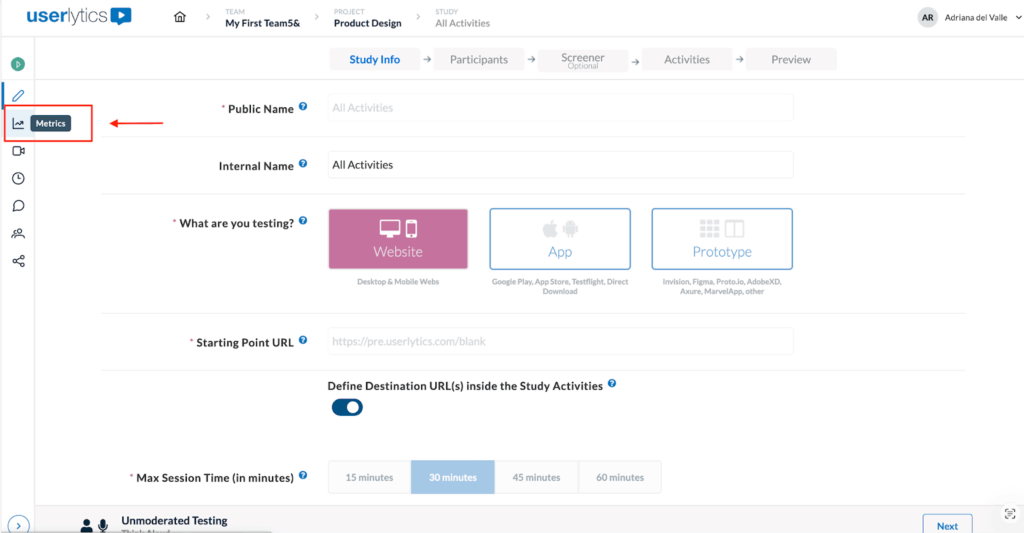
To get started, locate your latest study and navigate to the left-hand panel. From there, you’ll find the Metrics section, which contains all the data associated with the study you ran.
Once there, you’ll be able to see up to four tabs at the top of the page, depending the characteristics of your study:
- Activities
- Participants
- Sentiment Analysis
- AI UX Insights
Filtering Results
Filters allow you to focus on specific segments of your data and compare participant performance across different criteria. The filters you apply affect the information displayed across all activities within your study, and they remain active even when you switch between activities.
Depending on the type of study, you may see the following filters at the top of the Analysis page:
- Participants: Always available. Use this filter to select one or multiple participants and compare their results side by side.
- Screeners: Available only if screener questions were included in your study. Use it to view responses that meet specific screener criteria.
- Demographics: Available for PANEL studies only. Use it to filter participants by attributes such as age, gender, or location.
There are two types of filters in the Analysis section:
- The top-right filters (Participants, Screeners, Demographics) apply to ALL results displayed in the dashboard.
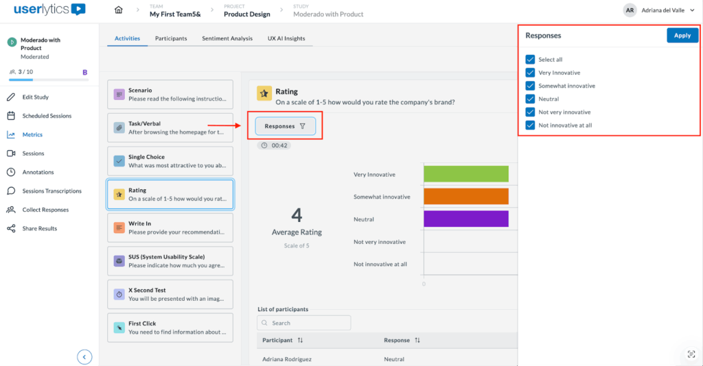
- The top-left “Responses” filter affects only the current activity’s metrics and visualizations.
When you apply a filter, the graphs, metrics, and response lists below update automatically to reflect your selections.
To download responses, locate the three-dot menu on the left side of the screen and you’ll see the option to download as a CVS file.
Let’s review how to view and analyze metrics per activity type!
Activities
1. Scenario
The ‘Scenario’ activity is commonly used to show instructions to the participants. To visualize the results, simply click on the Scenario icon and the following screen will appear showing the average time on task per participant.
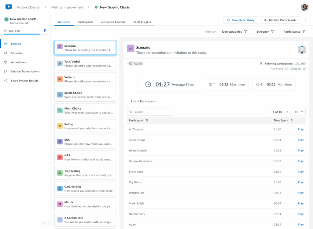
The Scenario activity provides:
- Average time all participants take to complete the activity.
- Longest and fastest completion times.
- Participant list with individual completion times and play buttons to watch each individual activity clip. Option to filter data ascending or descending.
2. Task/Verbal
This activity type asks testers to complete an action without an associated performance metric. However, during setup in the Study Builder, you can enable an optional self-report question where testers indicate whether they successfully completed the task.
- Success/Failure – Whether they completed the task successfully
- Difficulty Level – On a scale from 0-7
To visualize responses, click on the Task/Verbal activity.

The activity displays:
- The average, max, and min response times
- A pie chart with % of success/failure rate
- Bar chart showing difficulty levels
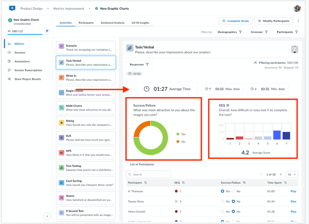
Below the metrics, see the list of participants with access to individual responses, time spent and clips.
If you need to change how individual responses are categorized (success vs. failure), you can update these classifications by selecting the appropriate radio buttons for each response. The system will automatically recalculate all associated graphs and metrics based on your updated classifications.
3. Write In
The Write In activity collects open-ended text responses from participants, providing rich qualitative insights into their thoughts, opinions, and experiences.
At the top, view completion metrics displayed side by side, including the average, maximum and minimum response times recorded.
Below the metrics, a sortable table displays individual participant data including their written answer, time spent on the task and video recording.
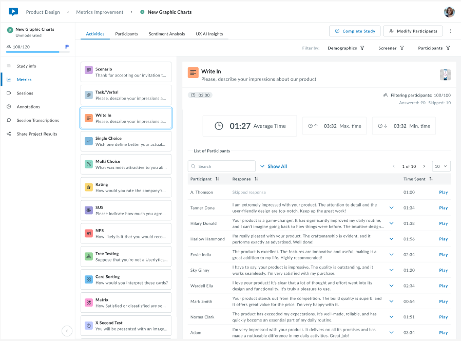
Use the Participants filter at the top right to view responses from specific participants or groups. Click “Show All” to expand the full list.
This task is ideal for gathering detailed feedback, understanding user reasoning, collecting feature requests, or exploring participant perspectives in their own words. The combination of written responses and video playback provides context that purely quantitative data cannot capture.
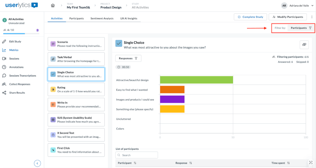
4. Single Choice
For a single choice task, the system shows aggregated results.
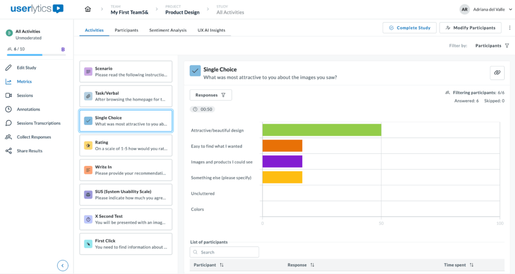
By hovering over results, you can visualize both percentages and absolute numbers. While percentages provide a quick overview when you have a large sample, absolute values provide more context in smaller qualitative studies.
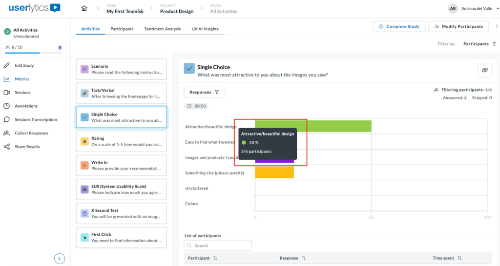
You can also filter results per participant(s) by clicking on the Participants filter button on the upper right-hand side of the screen or by “Responses”.

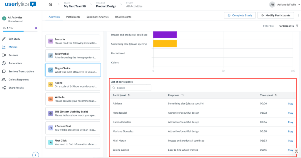
Additionally, below the graphs you can access a list showing each participant’s answer, completion time, and video response. Click the play button to watch any video clip.
5. Multiple Choice
Similar to Single Choice, the system will display aggregated results for multiple choice tasks in a visual chart.
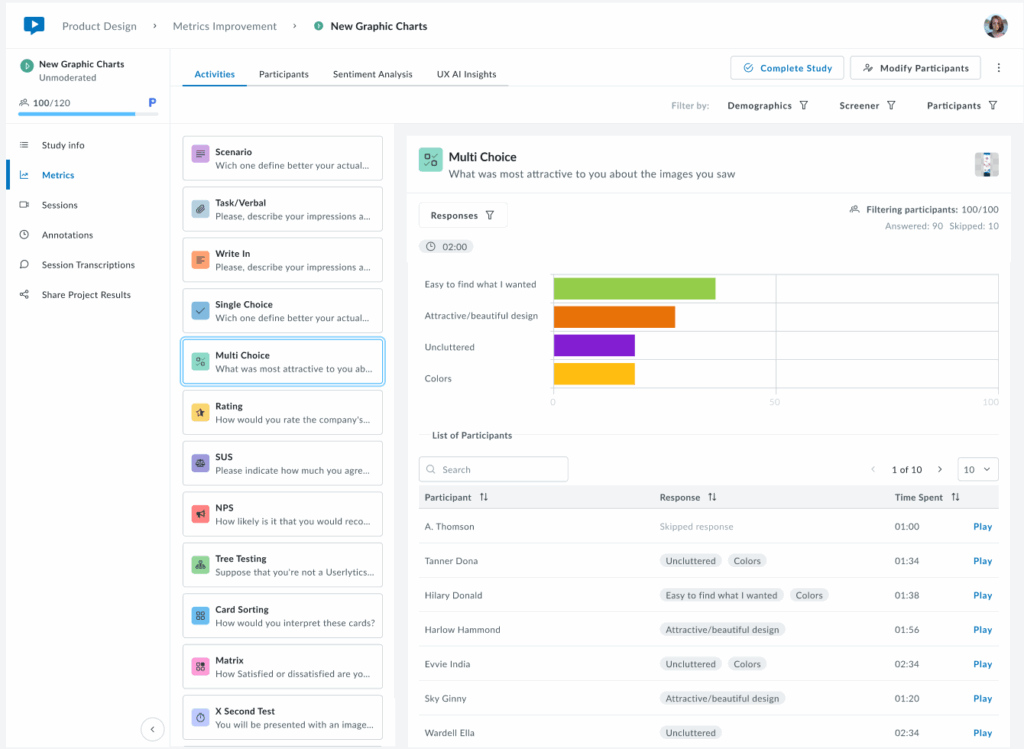
To view data, hover over results to see both percentages (useful for large samples) and absolute numbers (better for smaller qualitative studies). Filter results as needed as explained under the “Filtering Results” section above.
Below the chart, view a list of each participant’s answer, completion time, and video response.

6. Rating
The Rating activity works similarly to the Single Choice activity, as participants select a single response. It’s a great way to gauge user sentiment on a website, interface, app, or prototype.
The results are displayed as a color-coded chart that always sums to 100%, making trends easy to interpret at a glance.
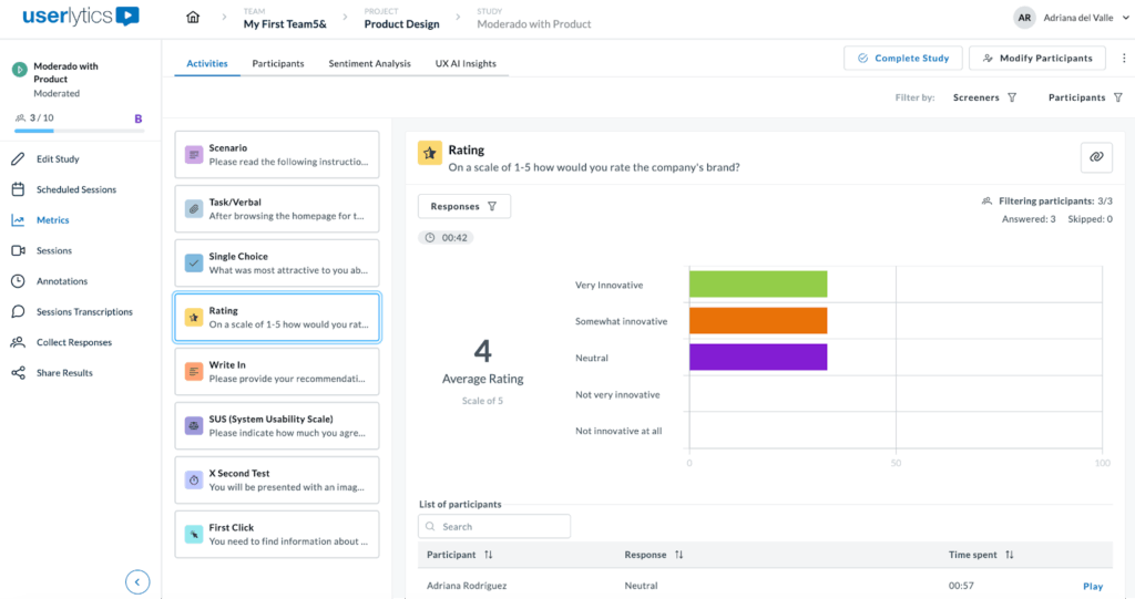
Results can be filtered by Participant or by Responses as seen below. Simply select the responses you wish you to filter by and they will be displayed in a bar chart format.
In summary, this metric shows user sentiment, including:
- A bar chart showing ratings distributions.
- The average rating, offering a quick overview of sentiment trends.
- The users list each participant’s individual rating, time taken to complete the task, and the play button to view response.
This format is ideal to quickly identify satisfaction levels and usability issues at a glance.
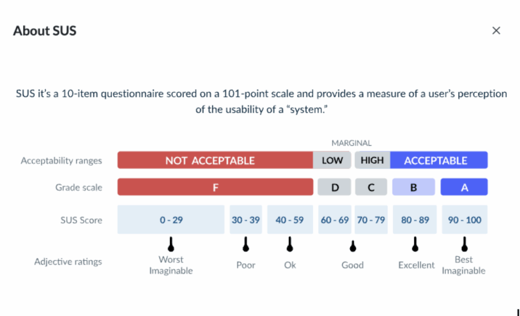
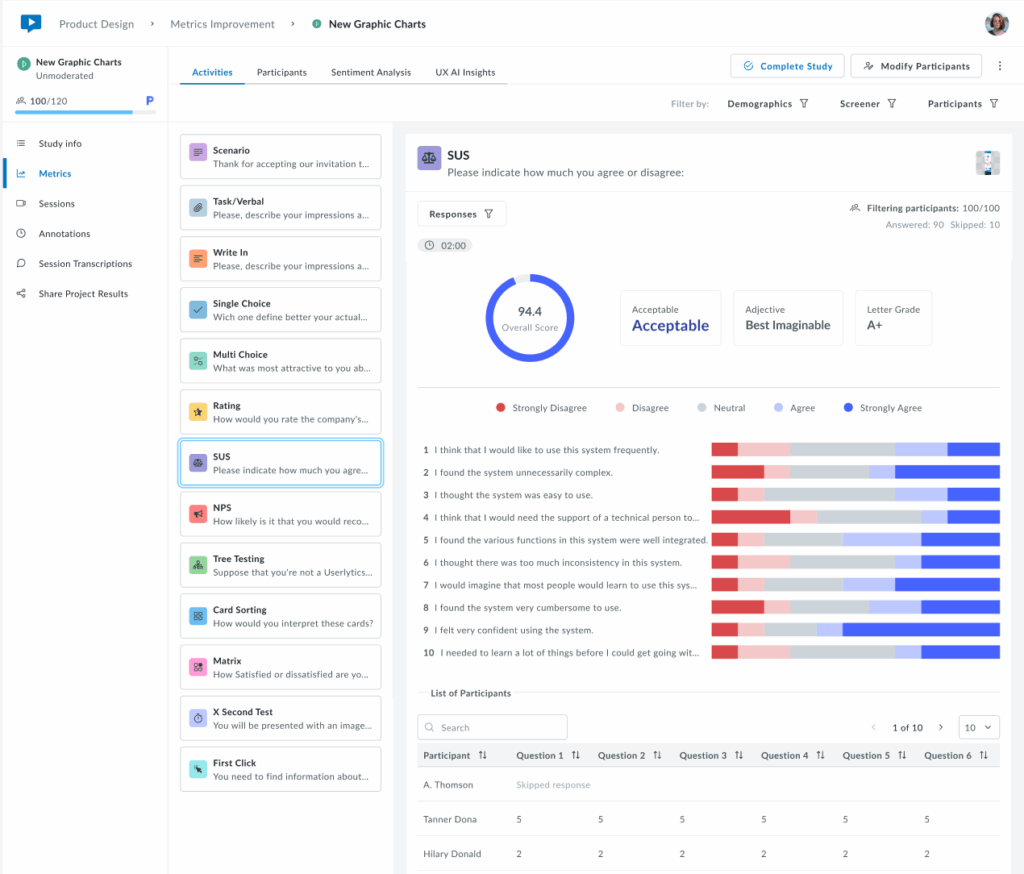
7. System Usability Scale (SUS)
The System Usability Scale (SUS) activity measures system usability through a standardized 10-question survey. Results are displayed in three sections:
1. Overall Score:
- Summary showing the overall SUS score (0-100 scale)
- Acceptability rating indicating if the score falls within Acceptable, Marginal, or Not Acceptable ranges.
- Adjective rating providing a qualitative descriptor (e.g., Best Imaginable)
- A letter grade that converts the score to a familiar grading scale
2. Response Distribution (Middle)
- Horizontal bar charts displaying response distribution for each of the 10 SUS questions
- Color-coded scale that ranges from Strongly Disagree (red) to Strongly Agree (blue), with Neutral (gray) in the middle
- At-a-glance insights to quickly identify which statements received positive, negative, or mixed feedback
3. Individual Participant Data (Bottom)
- Sortable table to view each participant’s responses to all 10 questions
- Question columns showing individual ratings (1-5 scale) per question
- Participant search to filter or locate specific testers
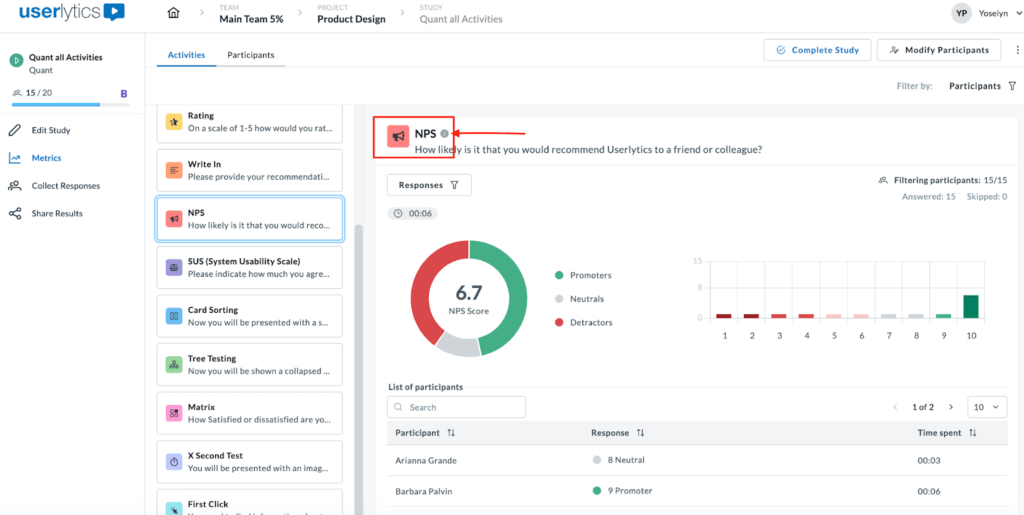
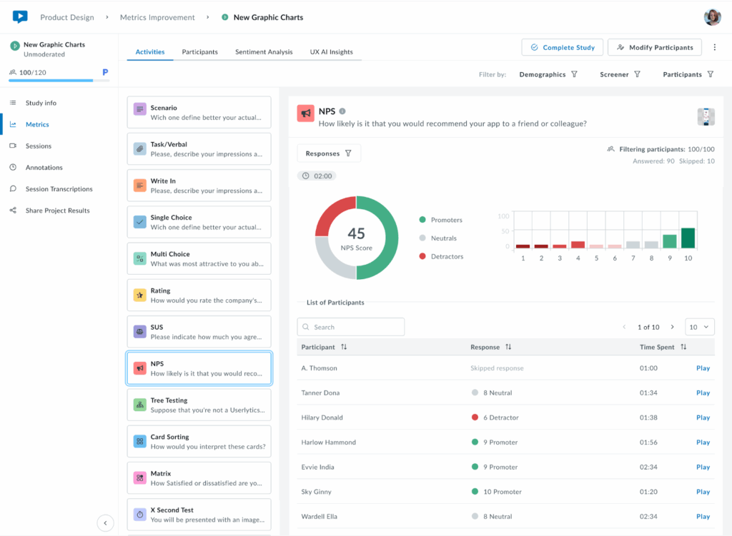
8. NPS
The NPS (Net Promoter Score) gauges how likely testers are to recommend the product they are testing, whether it’s a website, app, or another platform. The score reflects the overall sentiment towards the product based on their feedback.
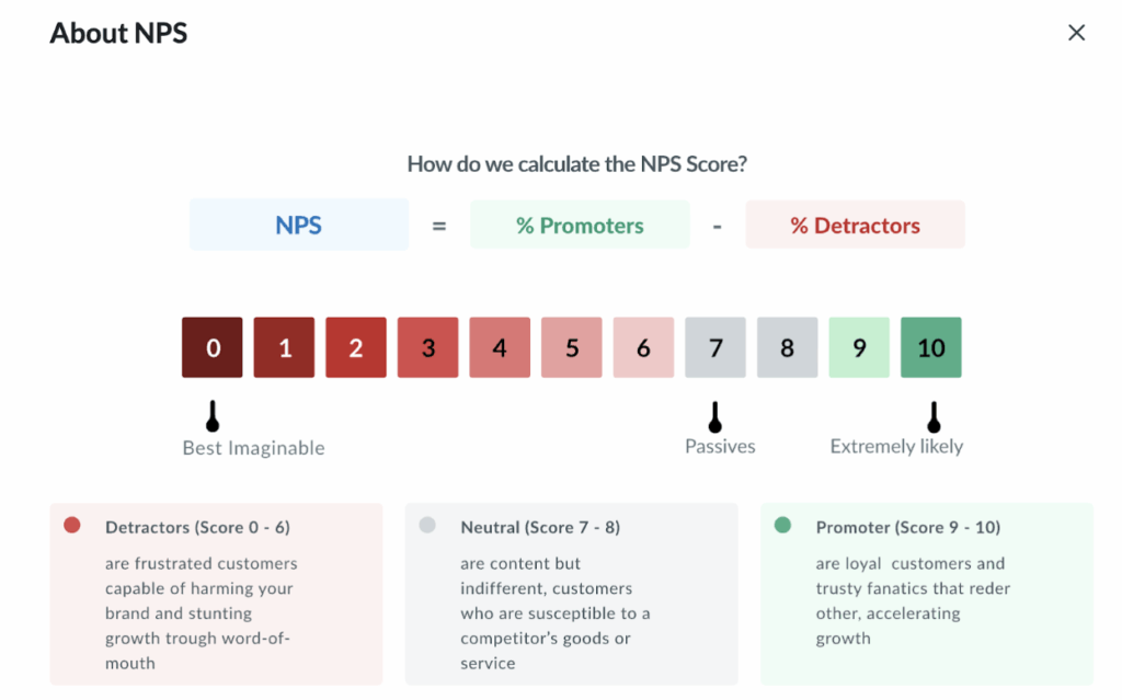
An infographic explaining how the NPS is calculated can be accessed by clicking the (i) icon next to the activity title.
Once you click on the (i) icon, the following pop up explaining NPS score calculation will appear.
For the NPS, we provide the overall score as pictured in the pie chart below, as well as the breakdown between promoters, neutrals, and detractors, and an adjacent bar chart. Below the graphs, find individual participant information, including individual scores, time spent, and video playback.
Keep in mind:
- A positive NPS indicates a strong base of loyal customers who are likely to recommend the product.
- A negative NPS suggests more detractors than promoters, pointing to potential dissatisfaction.
- An NPS score of 0 signals a neutral stance, where users are on the fence about the product.
The NPS is a useful metric to measure user satisfaction and loyalty. To boost the NPS, focus on turning Neutrals (7-8 scores) into Promoters (9-10) by improving the user experience, resolving pain points, and engaging with feedback.
9. Tree Testing
Tree Testing evaluates how intuitively users can find information within your site’s navigation structure.
In the metrics section, you can access different views of your data, including:
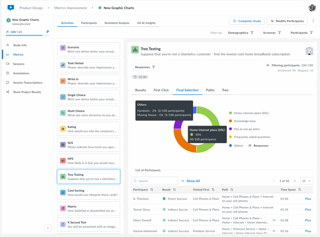
- Results: Success/failure rates and overall performance
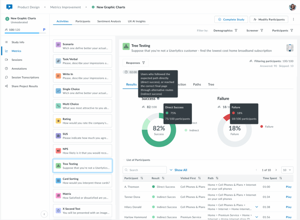
The Results tab provides a high-level overview of task completion performance through two interactive donut charts. The Success chart displays the overall success rate as a percentage in the center, with the participant count shown below (e.g., 82/100).
The chart is divided into Direct Success (dark green) for users who followed the expected path immediately, and Indirect Success (light green) for users who reached the correct answer through alternative routes.
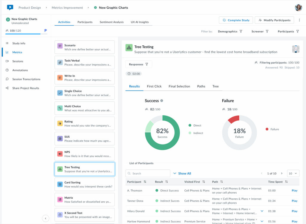
Hover over each segment to view the exact percentage and participant count. The Failure chart (right) shows the overall failure rate as a percentage, with the total number of failed attempts. Below the charts, a sortable table displays individual participant results, including their outcome (Direct Success, Indirect Success, or Failure), first click, navigation path, completion time, and video playback option. Use the Responses filter as needed.
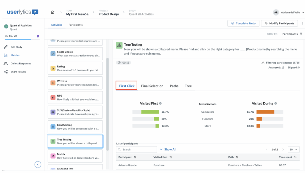
- First Click: Analysis of users’ initial navigation choices
The First Click tab shows where participants clicked first when starting the task, helping identify which labels are more intuitive or misleading.
The “Visited first” and “Visited during” metrics help you understand user navigation behaviors through the hierarchical structure you’ve set up.
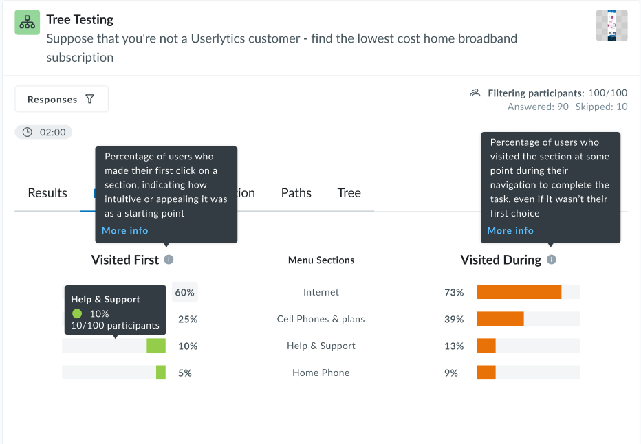
Here’s how these percentages are calculated, assuming a panel of 100 participants.
Visited First
This metric indicates how many participants first clicked on a particular node when attempting to complete a task.
Formula:

Example:

If 25 out of 100 participants clicked on the node “Help Center” as their first action, then:
Visited During
This metric reflects how many participants clicked on a particular node at any point during their navigation path, not necessarily the first or final click.
Formula:

Example:
If 60 out of 100 participants visited the “Pricing” node at any time while trying to complete the task:

Additional information:
- These metrics are calculated per activity, so for multi-task tree tests, you’ll get different percentages for each task.
- They help identify misleading labels, confusing hierarchy, or well-performing paths.
- If participants drop out or skip the task, they’re generally excluded from the denominator.
- Final Selection: Where users ended their journey
The Final Selection tab shows which menu items participants chose as their final answer. The legend on the right identifies each menu item by color, making it easy to see where participants ended their navigation journey. Below the chart, a table lists each participant’s first click, complete path taken, and time spent.
This view helps identify whether users are selecting the correct destination or ending up in wrong locations, revealing potential issues with menu structure or labeling. You may filter by participant(s) to isolate specific results.
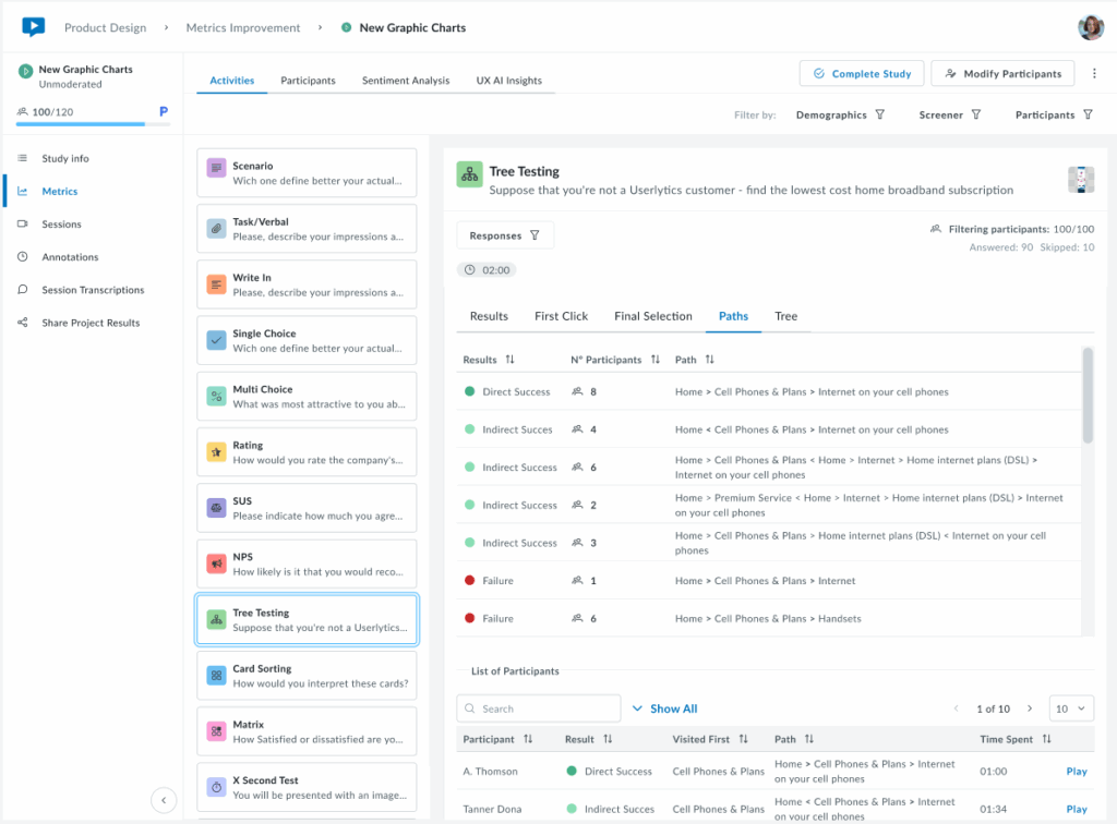
- Paths: Complete navigation routes taken
The Paths tab displays a summary of all unique navigation routes taken by participants, showing how many users followed each specific path through the menu structure.
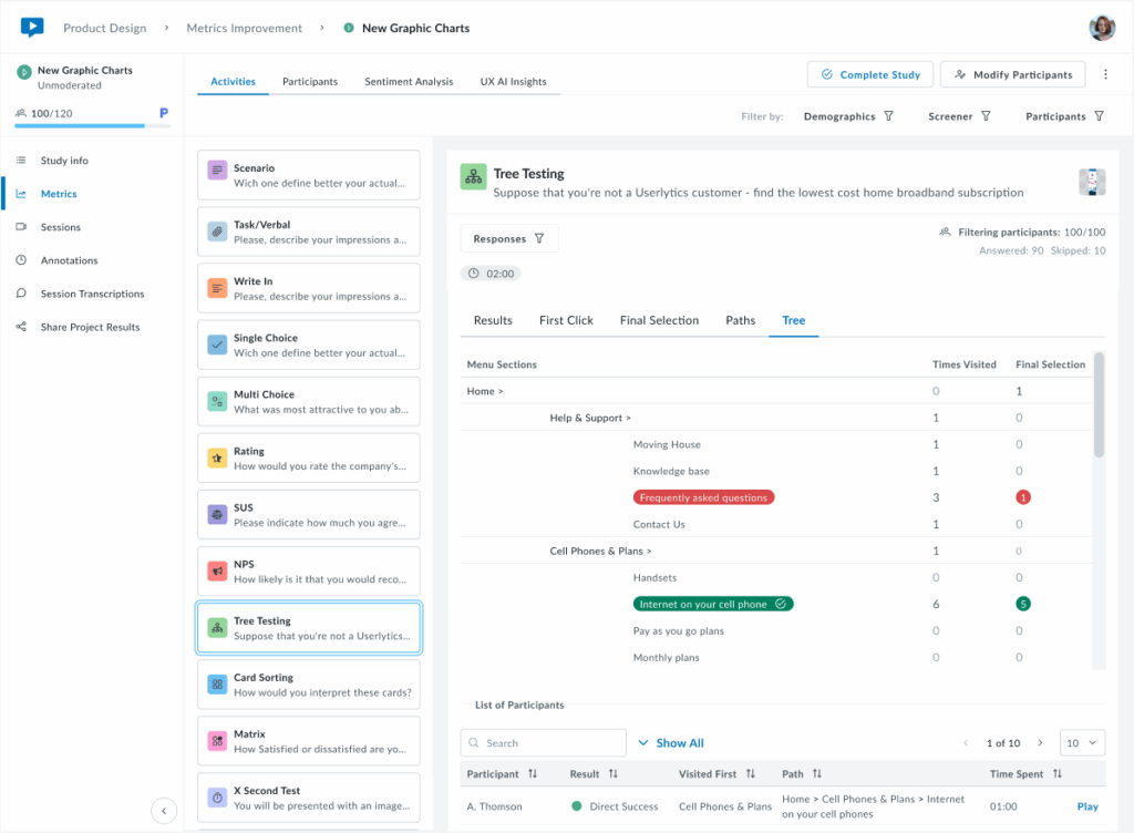
- Tree: Visual representation of the menu structure
The Tree tab displays the complete menu hierarchy, showing how many times each section and subsection was clicked during navigation and how many participants selected each item as their final answer.
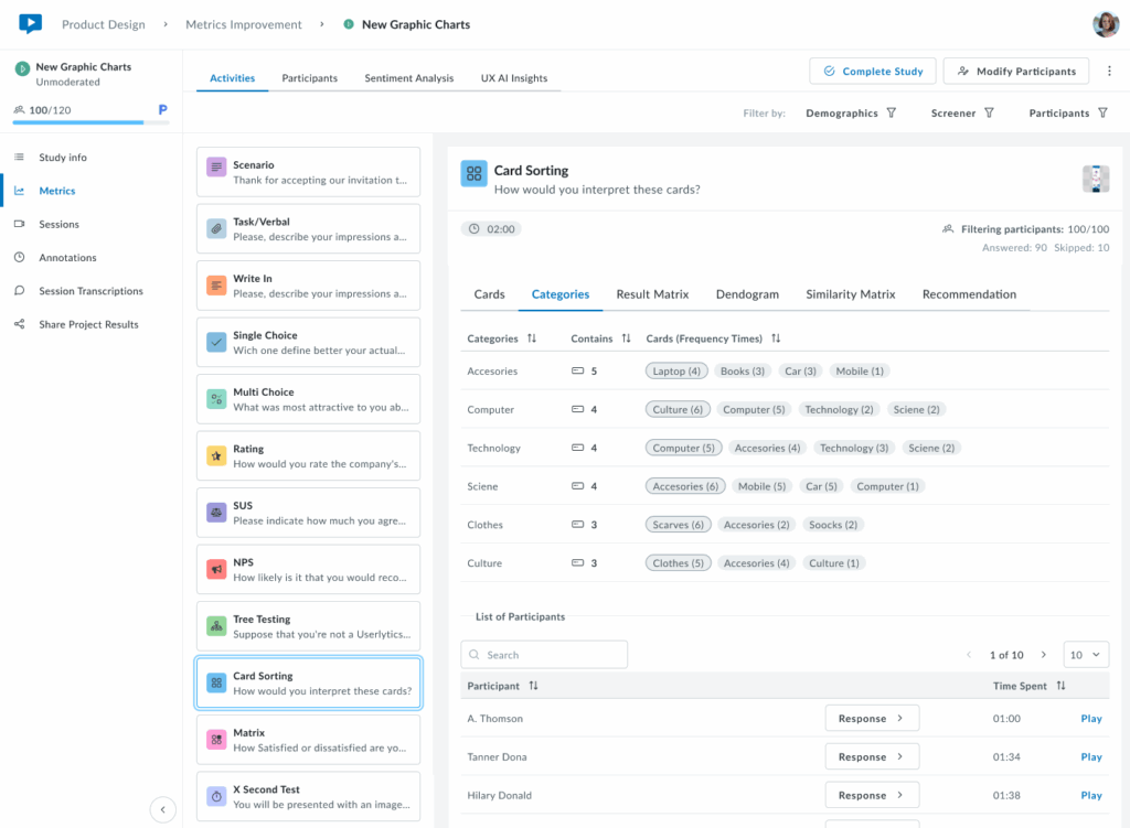
10. Card Sorting
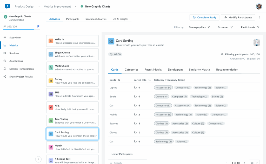
The first tab of results is the Cards tab, which provides an overview of how participants categorized each card in your study. You’ll see a sortable table that displays all cards and the different categories participants used and how often.
- Cards
Cards sorted into fewer categories with high agreement indicate clear, intuitive groupings. Cards sorted into many different categories suggest confusion or ambiguity in labeling, signaling opportunities to refine your content structure.
Below the cards overview, access each participant’s complete sorting choices, time spent, and video recording to understand their reasoning and decision-making process.
2. Categories
The Categories tab shows which cards were placed in each category. Categories can be created by participants, predefined by researchers in the Study Builder, or a combination of both.
Each category row displays the total number of cards it contains and lists all cards sorted into that category with their frequency counts (e.g., “4 (15)” means card “4” was placed in this category by 15 participants). Below, view individual participant responses and completion times to explore how each person organized the cards.
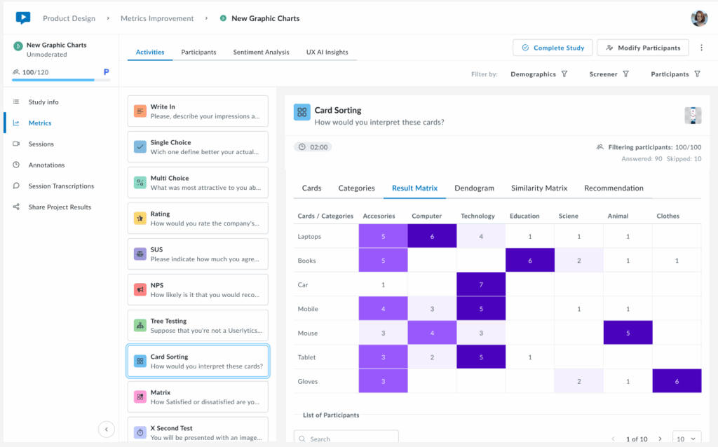
3. Result Matrix
The Result Matrix displays a color-coded heatmap showing how many participants sorted each card into each category. Rows represent cards, columns represent categories, and the intensity of the purple color indicates frequency:
- Dark purple – First option with the most responses (highest agreement)
- Medium purple – Second option with more answers (moderate agreement)
- Light purple – Third option with fewer answers (lower agreement)
The numbers inside each cell show exactly how many participants placed that specific card in that category. This visualization quickly reveals strong patterns of agreement (dark cells with high numbers) and areas of confusion (cards spread across multiple categories with low numbers).
4. Dendrogram
A brand new visualization that shows a hierarchical tree visualization that reveals how cards cluster together based on participant sorting patterns. Cards that were frequently grouped together appear closer in the tree structure, with branches showing the strength of their relationships.
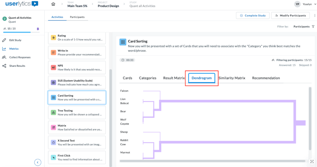
This powerful visualization helps you identify natural groupings and understand which cards participants consistently associate with one another. The horizontal distance between branches indicates how strongly related the cards are, while the shorter distances mean stronger associations. Use this view to discover logical category structures that align with user mental models.
5. Similarity Matrix
The Similarity Matrix is a color-coded grid that shows how frequently participants grouped pairs of cards together.
Each cell displays the percentage of participants who sorted both cards into the same category. Darker purple cells indicate stronger agreement, meaning most participants grouped those cards together, while lighter cells show weaker associations.
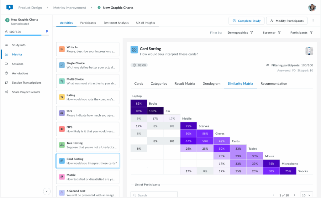
This matrix helps you identify which cards have strong natural relationships in users’ minds (high percentages) and which cards don’t clearly belong together (low percentages). Use this data to validate potential category groupings and spot cards that consistently cluster together across participants.
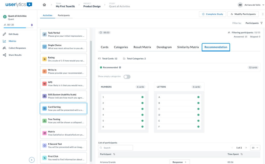
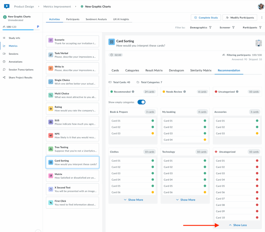
6. Recommendation
The Recommendation tab provides smart, data-driven category suggestions based on participant sorting patterns. Cards are automatically tagged as Recommended (green indicators) when there’s strong agreement among participants about their category placement.
At the top, you’ll see a summary showing the total number of cards and categories, along with a count of recommended cards. Use the “Show empty categories” toggle to view or hide categories with no card assignments. This intelligent analysis helps you quickly identify which category structures have strong user consensus, making it easier to finalize your information architecture with confidence.
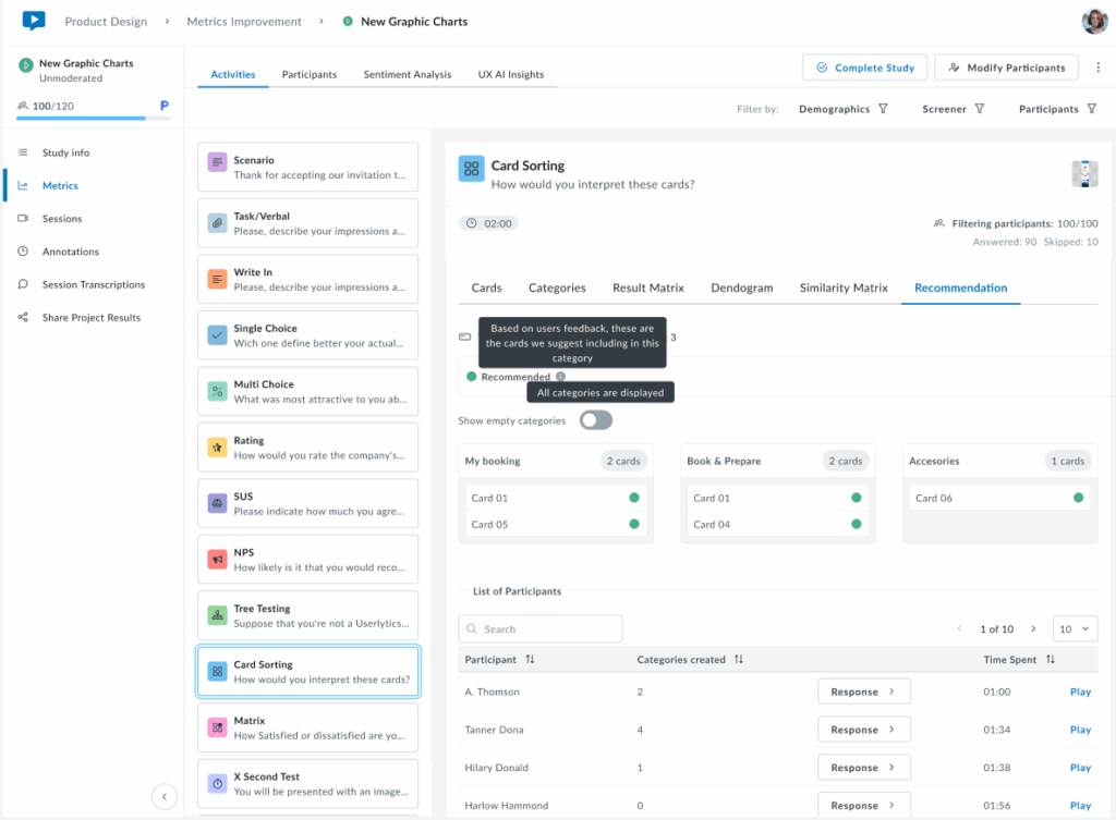
When you hover over icons or indicators in the Recommendation tab, small black tooltips appear to explain their meaning.
For example, hovering over the Recommended tag displays the message “Based on users’ feedback, these are the cards we suggest including in this category.”
This indicates that there is strong participant agreement on where each card belongs. Another tooltip appears near the category toggle, stating “All categories are displayed,” confirming that all available categories are currently visible.
The following view shows the Recommendation tab in a more typical scenario where cards have mixed classification statuses. The system automatically tags each card based on participant sorting behavior. Cards marked with a yellow indicator are tagged as Needs Review, suggesting that user responses were inconsistent or unclear. When hovering over the yellow tag, a tooltip appears that reads: “User responses suggest that these cards are unclear. It may be worth considering a different category or renaming the card.” This helps users understand why certain cards may require attention or adjustments.
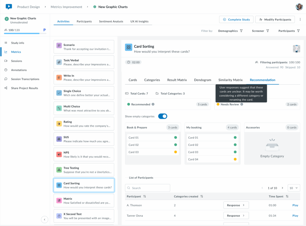
At the top, a summary shows the total number of cards and categories, along with a count of cards under each status. The Show empty categories toggle is on, so even empty categories (like “Accessories”) are displayed. This provides a complete overview of all possible categories, helping users see both assigned and unassigned cards in one place.
The following view shows the Recommendation tab with all three card statuses: Recommended (green), Needs Review (yellow), and Uncategorized (red). These tags indicate how consistently participants sorted each card.
Hovering over each label displays a tooltip explaining its meaning. For example, the Uncategorized tooltip says the system couldn’t place those cards into any category due to low participant agreement.
At the top, you’ll see the total number of cards and categories, along with counts for each status. Through the Show empty categories toggle you can see all categories being displayed, including the empty ones.
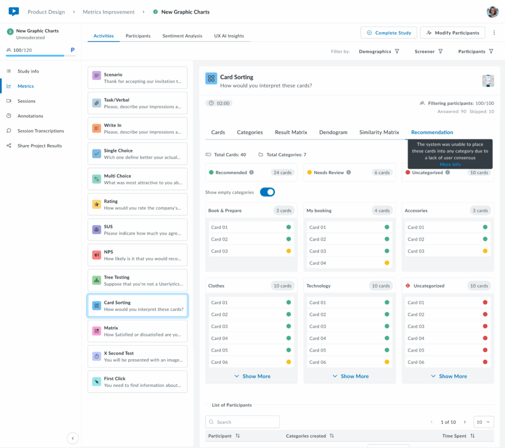
Only 6 cards are shown per category. If you want to see all cards per category, click on the “Show More” button and all cards corresponding to a category will appear.
Lastly, this view shows the Recommendation tab when all cards are classified as Uncategorized (red). This means the system was unable to assign any cards to a category due to low participant agreement. The tooltip explains: “The system was unable to place these cards into any category due to a lack of user consensus.”
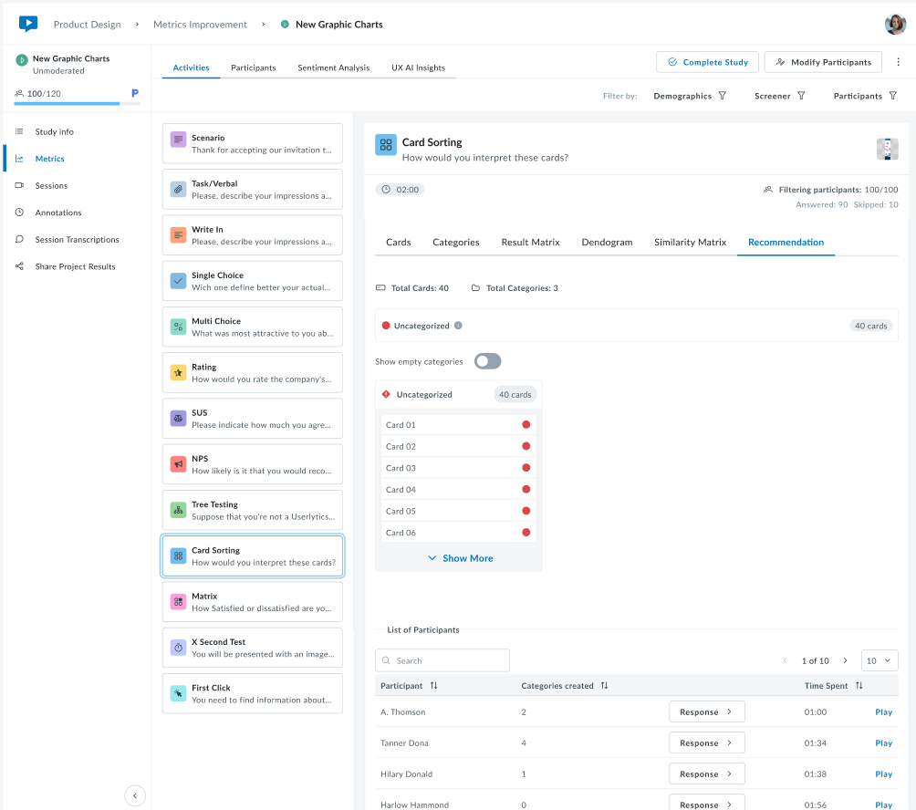
This scenario typically indicates that participants sorted the cards in very different ways, with little overlap between their choices. It signals that the categories or card labels may need to be reviewed or refined before finalizing the information architecture.
11. Matrix
The Matrix activity measures user satisfaction across multiple dimensions, allowing you to evaluate several aspects (such as product features, pricing, experience, or support) simultaneously using a consistent rating scale.
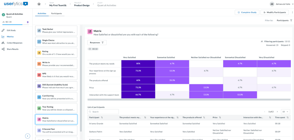
The color-coded matrix shows response distribution across a 5-point satisfaction scale. Darker or highlighted areas indicate features that participants find most valuable, offering insights into areas of high engagement. Variations in response patterns across rows reveal differences in user preferences, helping you identify opportunities for improvement or customization.
Below the matrix, a sortable table displays each participant’s ratings for all questions and completion time. This allows you to dive into individual responses and understand the reasoning behind specific ratings.

To download responses, locate the three-dot menu on the left side of the screen and you’ll see the option to download as a CVS file.
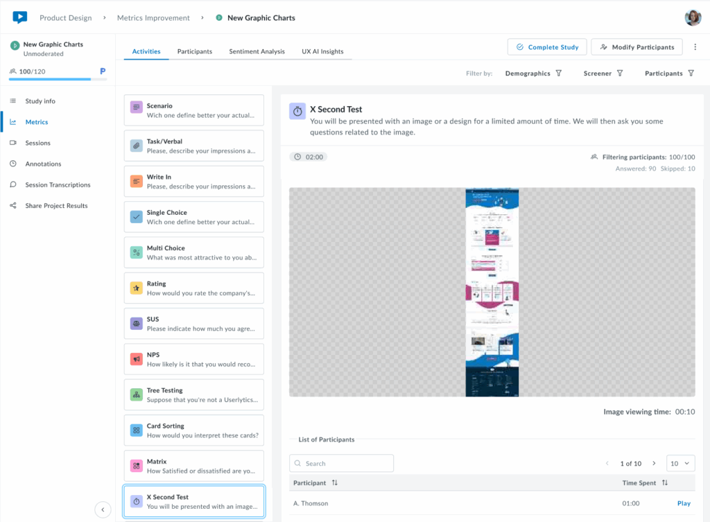
12. X Second Test
The X Second Test evaluates first impressions by displaying an image or design for a limited time, then asking participants follow-up questions to assess what they can recall first.
The interface shows:
- The design or image shown.
- Viewing duration.
- The participant list with time spent and video playback for each session.
This is ideal for testing visual hierarchy and immediate messaging.
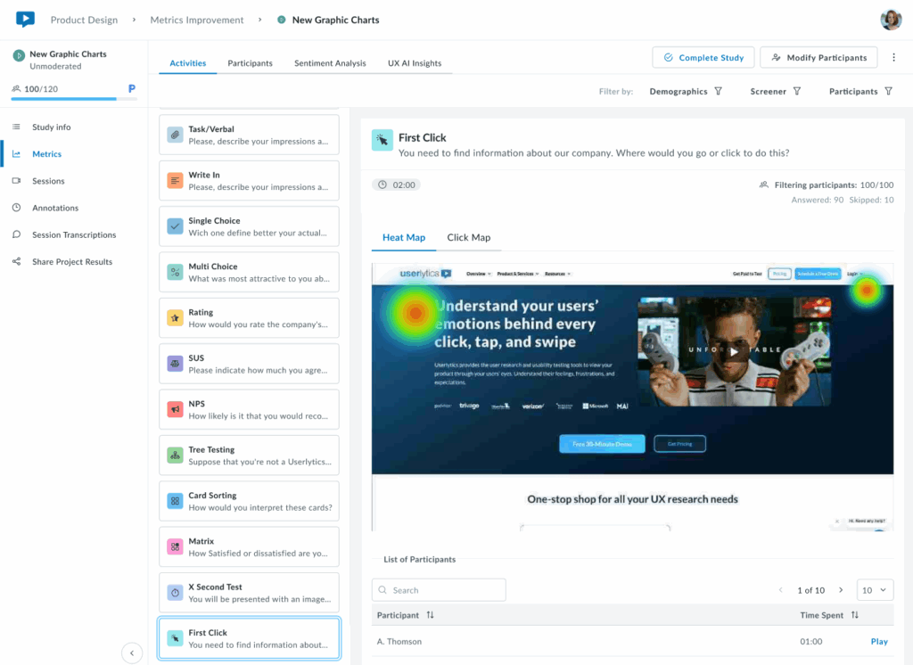
13. First Click
The First Click activity tracks where users click first in an interface, evaluating navigation and linking structure.
Toggle between two visualization modes:
Heat Map: The results are displayed as a heatmap showing the areas where participants clicked most frequently. Heat zones are color-coded to represent click density, with warmer colors (red, orange) indicating higher concentrations of clicks and cooler colors (green, blue) showing lower activity.
Click Map: Displays precise individual click positions overlaid on the design.
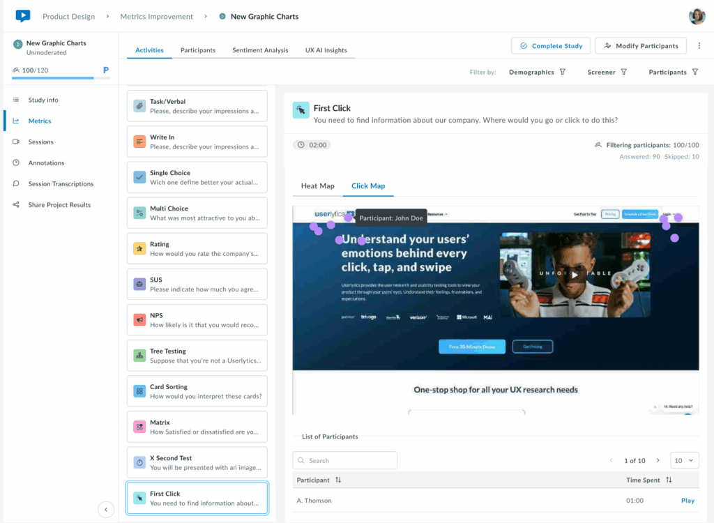
Below the visualization, a sortable table lists each participant with their time to first click.
Key Insights:
If first clicks concentrate on the correct element (e.g., a primary CTA or navigation item), your visual hierarchy is working. Scattered clicks or concentration in unexpected areas signal potential issues with visual prominence, labeling, or layout that may require adjustment.
Ideal for validating that users navigate intuitively from the start and that the most important elements stand out effectively.
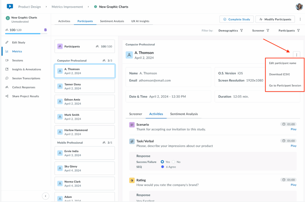
Participants
The Participants tab provides a comprehensive view of all study participants, with detailed information about each individual’s session and responses. Head to the three-dot menu on the right-hand side of the screen to edit participant’s names, download data into a CVS file, and more.
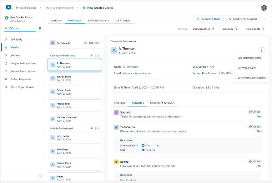
Click any participant card to view their detailed information such as Screener, Activity responses, and sentiment analysis if there is one available. You’ll have the option to download individual data by clicking on the three-dot menu on the left.
View overall sentiment breakdown with a donut chart showing Positive, Neutral, and Negative sentiment distribution, plus an average sentiment score.
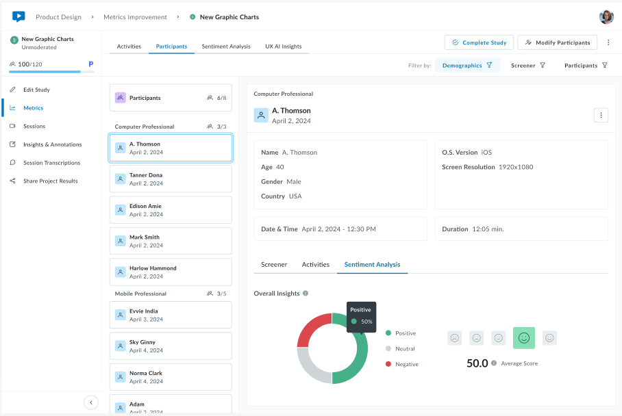
Use the Demographics, Screener, and Participants filters at the top right to narrow down the participant list by specific criteria.
Sentiment Analysis
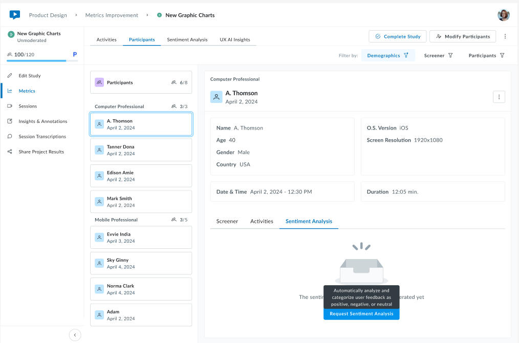
The Sentiment Analysis tab uses AI to analyze participant emotions and attitudes expressed during their sessions, providing insights into how users feel about your product or experience.
Generating Sentiment Analysis:
Sentiment analysis is not automatically generated for all studies. When you navigate to this tab, you’ll see one of two states:
- Not Yet Generated – A message states “The sentiment analysis has not been generated yet” with a blue Request Sentiment Analysis button
- Analysis Ready – Sentiment data is displayed across all participants
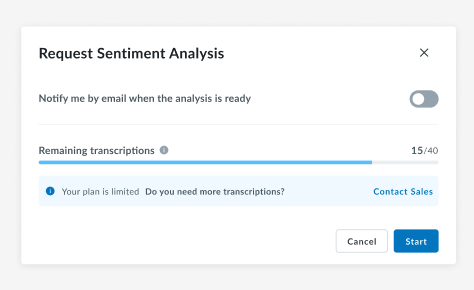
Requesting Analysis:
Click Request Sentiment Analysis to begin.
A prompt will appear with the following options:
- Email notification toggle – Enable to receive an email when the analysis is complete
- Remaining transcriptions counter – Shows how many transcription credits you have available (e.g., “15/40”)
- Plan limitation notice – If you’re running low on transcriptions, you’ll see “Your plan is limited. Do you need more transcriptions?” with a link to Contact Sales to increase the limit.
Click Start to begin processing, or Cancel to return without generating the analysis.
Once generated, view aggregated insights across all participants with overall insights, including:
Participants Analyzed – Percentage with completed analysis
Donut chart – Sentiment distribution (green = positive, gray = neutral, red = negative)
Average Score – Overall sentiment with indicators
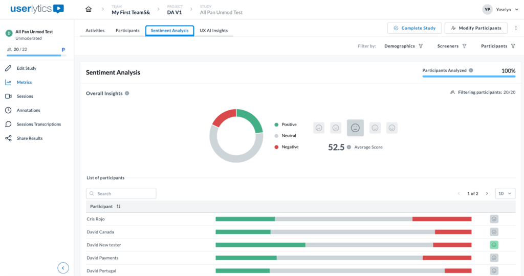
Each participant row displays a horizontal bar with color-coded segments showing their positive (green), neutral (gray), and negative (red) sentiment proportions, plus an overall emoji indicator. Click any participant for a detailed breakdown.
Use the top-right filters to analyze sentiment by Demographics, Screeners, or specific Participants.
AI UX Insights
With advanced AI algorithms, this feature is designed to analyze the qualitative video recordings of a UX study to summarize the key, actionable insights.
This feature eliminates the need for manual review of session recordings and saves a great deal of time, which can be repurposed to review and analyze only the most significant video recording moments.
Below, we’ll share how to quickly and easily generate an AI UX Analysis report from your UX studies.
Understanding Your UX AI Insights Report
Once you navigate to the UX AI Insights tab and transcriptions have been processed, you’ll see AI-generated insights from your study.
The UX AI Insights feature analyzes video and audio transcriptions to extract actionable insights such as:
- Common themes across participant responses
- Sentiment patterns and emotional reactions
- Key quotes and critical moments
- Behavioral insights
Each insight card highlights important themes, patterns, or observations discovered by analyzing the transcriptions. Longer insights may span multiple lines to provide complete context.
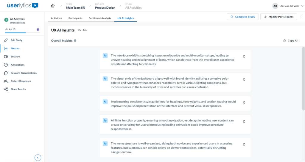
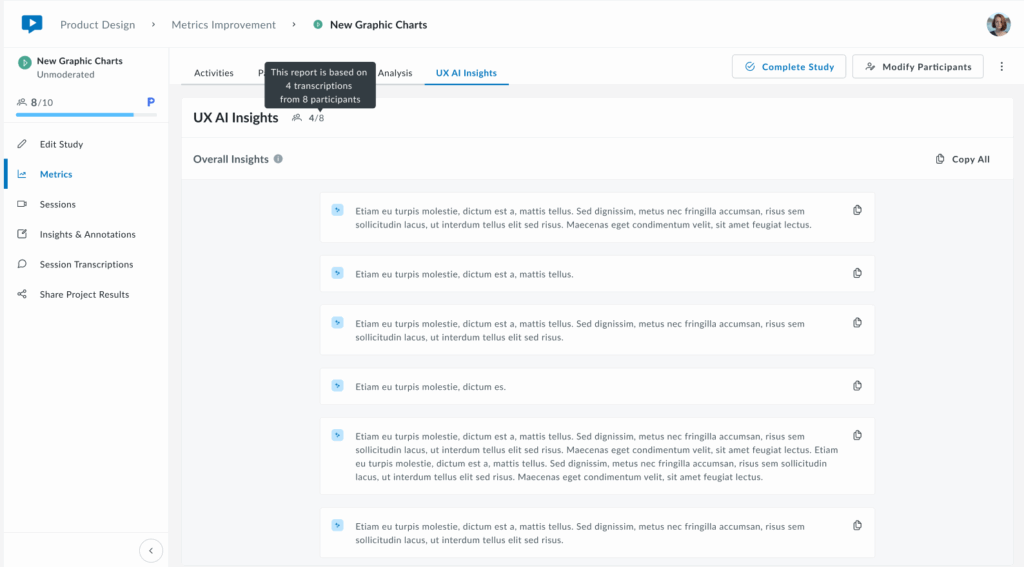
Next to UX AI Insights see how many participants have been analyzed (e.g., “4/6” means 4 out of 6 participants analyzed)
Note that the report is based on the participants available at the time you click “Generate UX AI Insights.” If you add new participants to your study after generating insights, you’ll see a notification on screen: “New study results are available.” Simply click on the “Refresh UX AI Insights” to get an updated report that includes the latest participants.
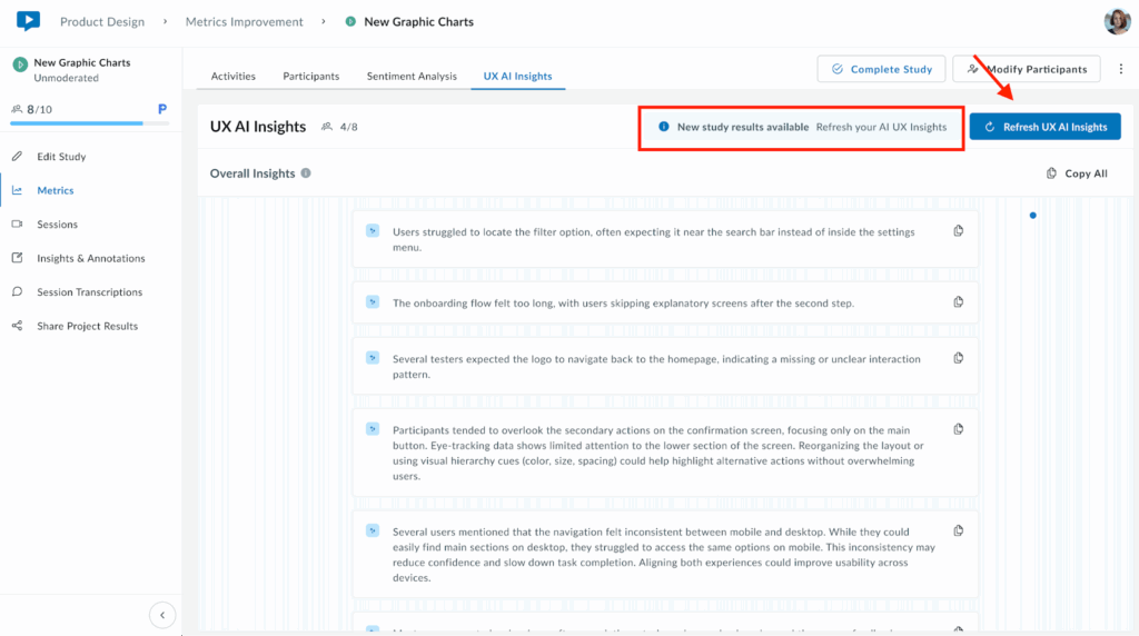
The Copy All button (on the top right) exports all insights to your clipboard for easy sharing or documentation.
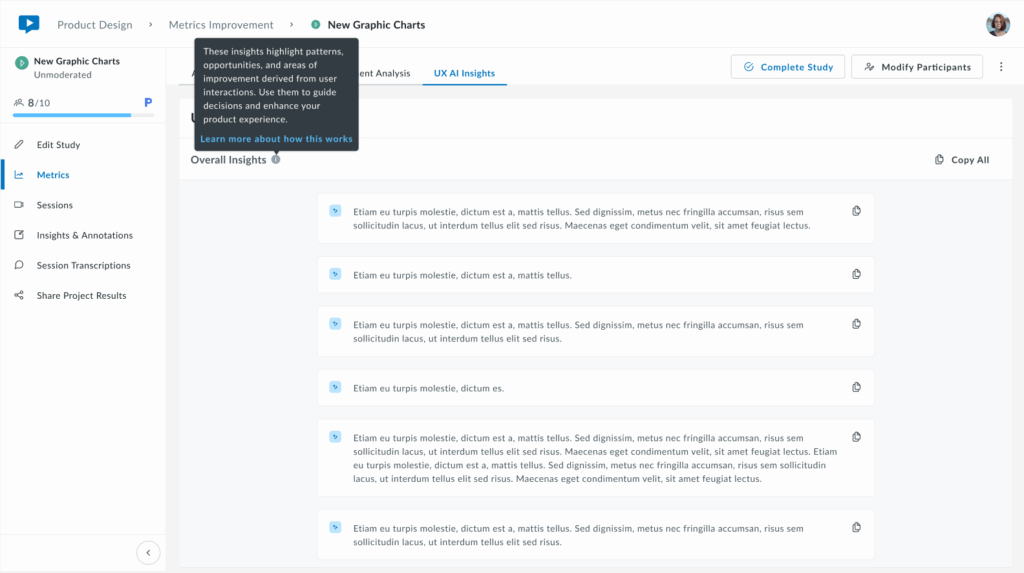
These insights are actionable starting points for product decisions, design iterations, and prioritizing improvements based on real user feedback.
Getting Started
When you first navigate to the UX AI Insights tab, you may see an empty screen with the following message:
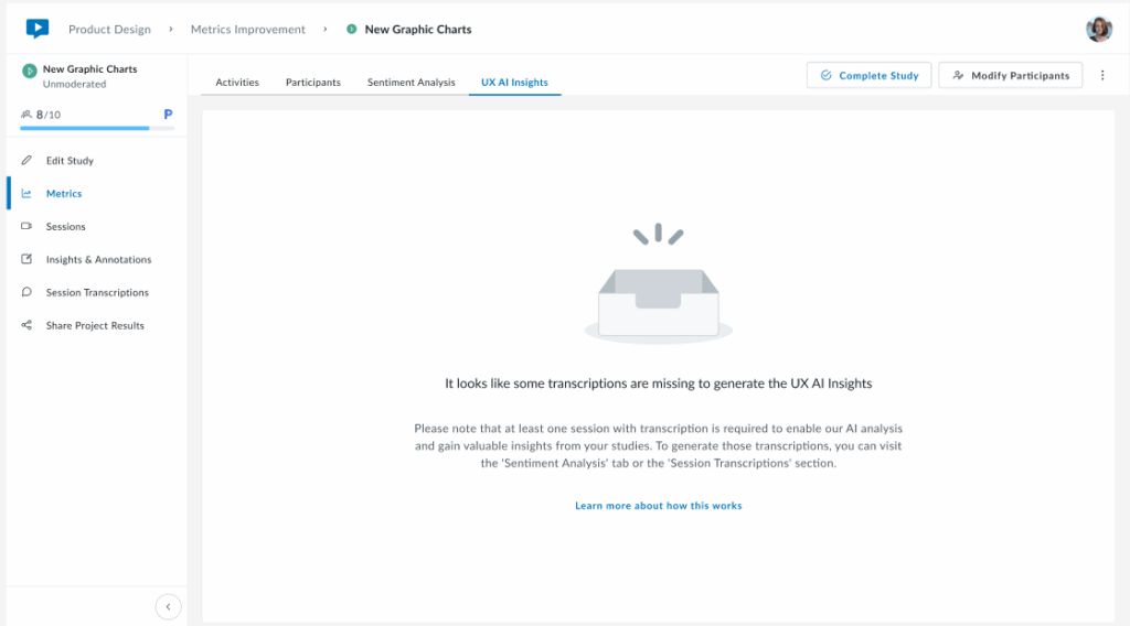
This occurs because the AI requires transcriptions to generate insights.
If no recordings have been transcribed, the AI has no input text to analyze, hence the section remains empty.
To activate and populate this section, follow these steps.
- Generate transcriptions for Video or Audio recordings:
- Go to your sessions.
- Go to transcriptions.
- Request the transcription.
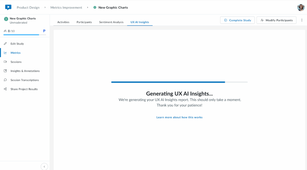
- Wait for processing to complete:
- Transcriptions may take a few minutes depending on the length of recordings.
- Once complete, return to the “UX AI Insights” tab and click on the “Generate UX AI Insights” button to get results.

It may take a few minutes for insights to be ready.
Note: Transcription and AI analysis features consume account credits. Check your remaining credits in account settings or contact sales for additional capacity.
If you have any questions regarding the Metrics section, reach out to your account manager for support.