With Userlytics’ easy-to-use test builder, you can create custom UX tests for your own participants or participants from our global panel of over 2 million participants.
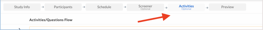
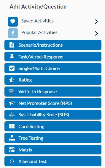
The Activities tab on your test builder allows you to choose from a variety of different task and question types for your usability test.
Each task comes with a generic template that you can adjust and edit as you please. Strategically choosing tasks that will help draw the insights you are looking for is key to conducting a successful usability study.
Below, we go over 11 different types of tasks, and how they can help you get the UX insights you are looking for.
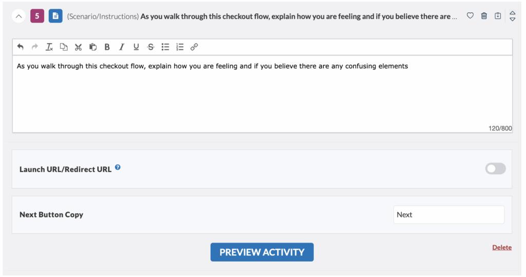
Scenario
The “Scenario” task sets the stage for your test by asking participants to imagine they are doing something specific.
For example, if you are testing an e-commerce website for pet products, the scenario task might be: “Imagine you are browsing for dog food made from natural ingredients.” A well-written scenario helps participants provide better feedback about your product.
In addition to setting the stage, the scenario task typically reminds participants to speak out loud throughout the test and share their thoughts. This provides valuable insights and helps you draw powerful conclusions about your product’s overall usability.
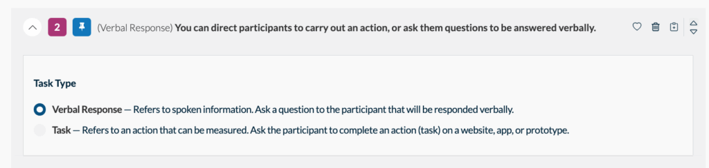
Task / Verbal Response
The “Verbal/Task” activity will prompt your participant to either answer a question out loud, or perform an action that can be measured. Which one should you choose?
Verbal Response (recommended in most cases) : Ensure participants can answer questions while following the instructions alongside the digital asset.
Task: Choose this activity type when it’s essential that participants start the task only after thoroughly reading the instructions. This approach is useful for accurately measuring the time taken to complete the task itself, excluding the time spent reading instructions. It ensures that the recorded timing reflects only the task completion duration.
When you select the ‘task’ activity type, the process for participants is as follows:
- Read the Question: Participants will first be shown the task question in full screen.
- Click Start: They must click the “Start” button to begin.
- Minimized Task Box: The task box or instruction box will be minimized after clicking “Start.”
- Full-Screen Prototype: Participants will then see the prototype/asset in full screen, ensuring they read the instructions first and have the full screen available for task completion.
- Once they have completed the task, participants will have to expand the task box and click “Next” to jump to the next question.
Using this method ensures participants are well-prepared before starting the task and that the recorded time accurately reflects their task performance.
Single / Multiple Choice
The “Single / Multiple Choice” task gives you the option of:
- Creating questions with only one correct answer
- Asking checkbox style questions where the participant can select more than one answer.
Single-choice questions are useful for determining if an aspect of your platform or prototype is clear to the consumer. With only one correct answer and the rest serving as distractors, participants must fully understand the content to select the correct option. Each participant can provide only one response to a single-choice question.
Multiple-choice questions are effective for gaining insights into the overall sentiments of your audience. If your results show that two or three answer choices are more frequently selected, it can indicate which aspects of your platform are successful and which may need improvement. For multiple-choice questions, participants can choose from one up to the total number of specified options. For instance, if you create a multiple-choice question with five possible answers, participant responses might include one, two, three, four, or all five of those choices.
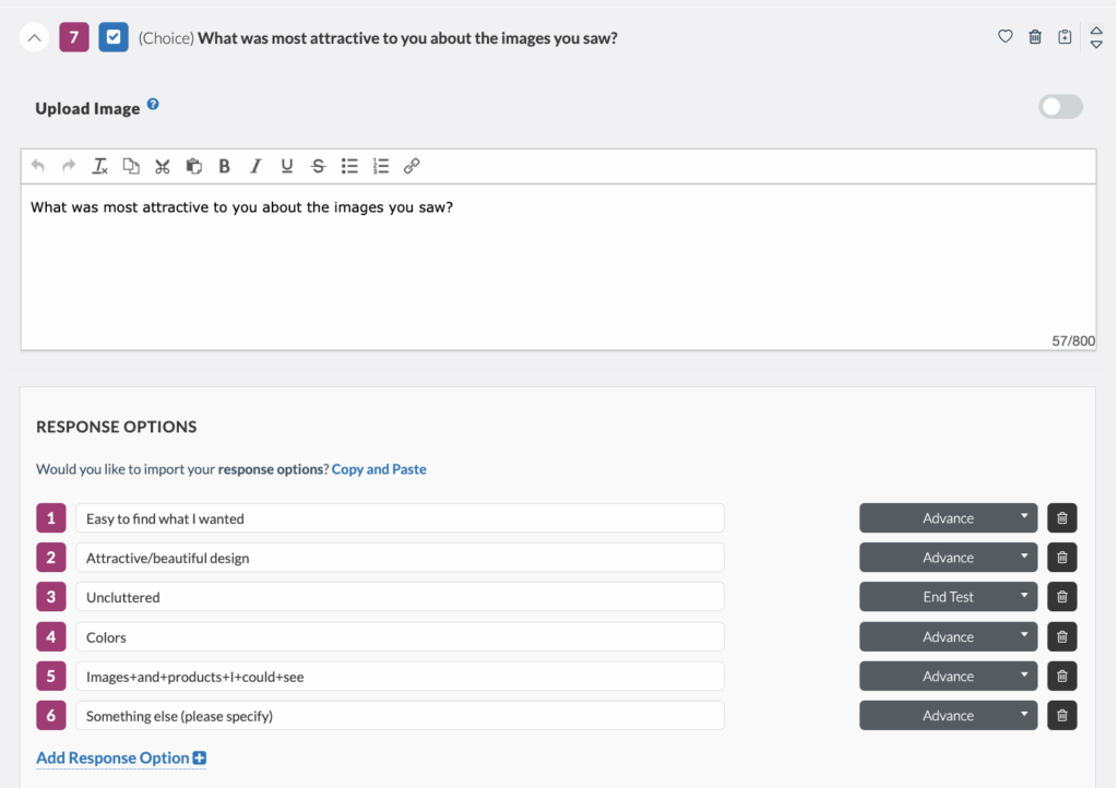
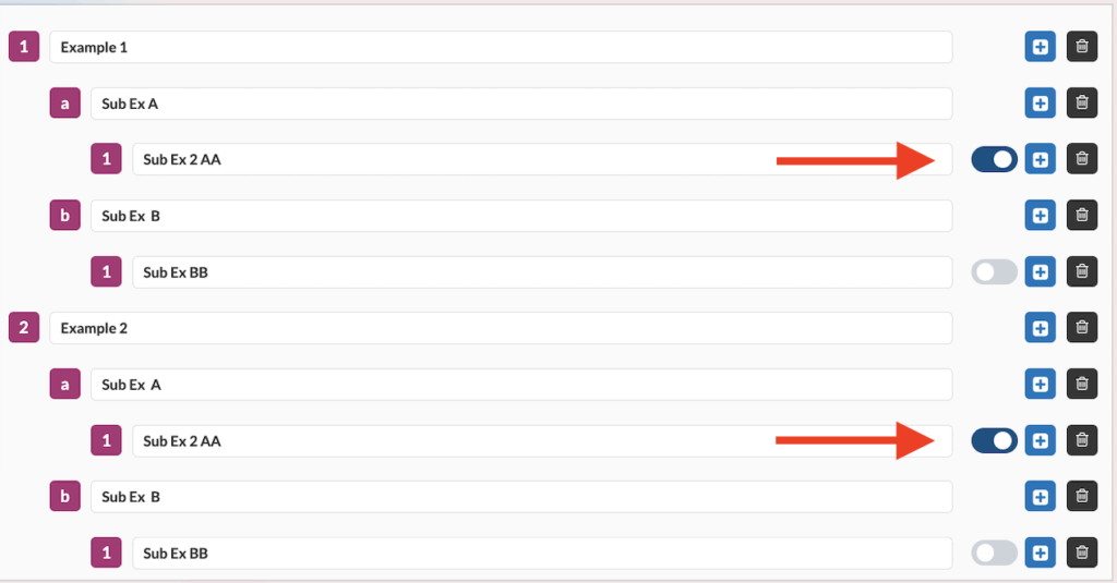
You will also notice that you have the option to use question logic, enabling a tester to either advance or be disqualified from a test based on your requirements.
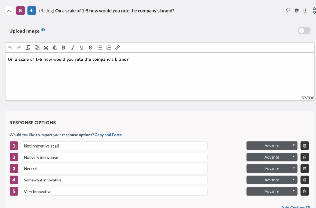
Rating
“Rating” questions use a scale to measure opinions in a group.
We use rating-scale questions to measure attitudes, beliefs, preferences, and self-reported behavior. This data helps us understand how users see our product or service.
A common rating task is asking participants to rate an aspect of your website, app, or prototype on a scale, with the lowest number being the worst and the highest number being the best.
Rating questions can have as many answer choices and display values (numbers, words, etc.) as the test creator wants. For example, with five answer choices, each participant will give one response between “1” and “5.”
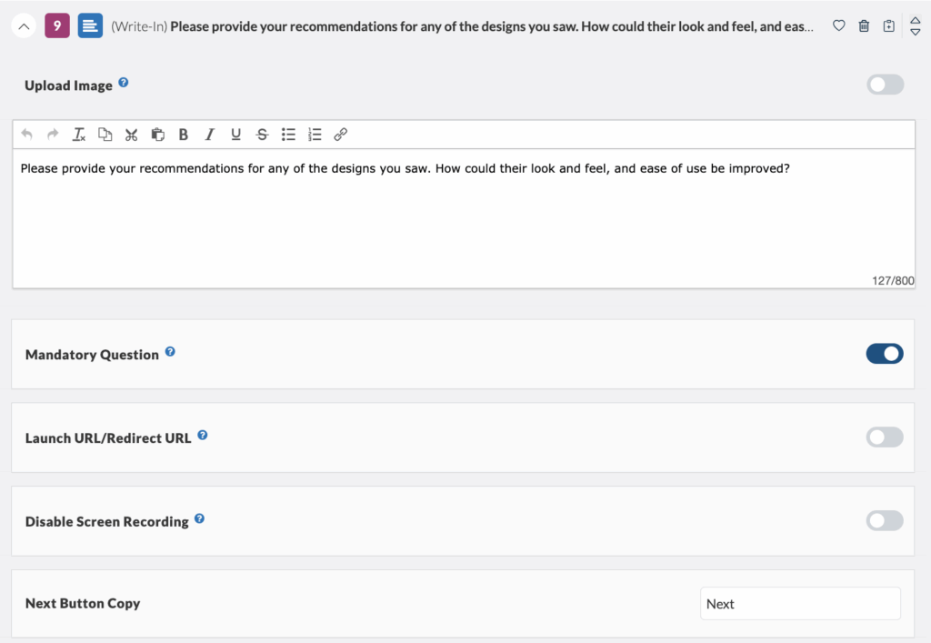
Write-in Response
“Write-in Response” tasks let you ask the participant an open-ended question and get a written answer. Some participants may feel more comfortable answering honestly in writing than with verbal prompts.
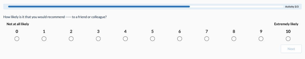
Net Promoter Score (NPS)
The “Net Promoter Score (NPS)” task measures the percentage of customers who would recommend a company, product, or service to a friend or colleague. According to Netpromoter.com, you calculate your NPS using answers to a key question on a 0-10 scale: How likely are you to recommend [brand] to a friend or colleague?
Respondents are grouped as follows:
- Promoters (score 9-10) are loyal enthusiasts who will keep buying and refer others, driving growth.
- Passives (score 7-8) are satisfied but unenthusiastic customers who are open to competitive offers.
- Detractors (score 0-6) are unhappy customers who can harm your brand and slow growth through negative word-of-mouth.
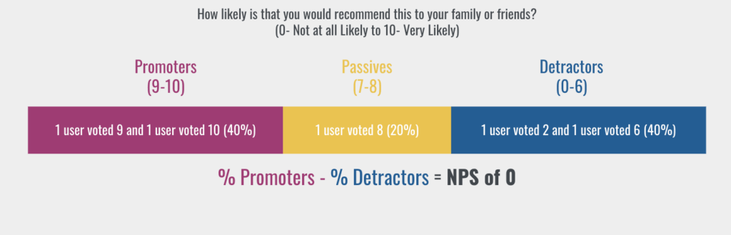
For this task, each participant’s answer is a number between 0 and 10. Subtracting the percentage of Detractors from the percentage of Promoters gives the Net Promoter Score (NPS). This score can range from -100 (if all customers are Detractors) to 100 (if all customers are Promoters).
If all customers give a score of 6 or lower, the NPS is -100. If all customers give a score of 9 or 10, the NPS is 100. The NPS helps you determine if you have correctly identified your customer’s needs in your prototype or platform.
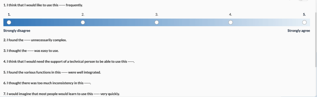
System Usability Scale (SUS)
The “System Usability Scale (SUS)” task is a quick, reliable tool for measuring product usability. It includes a 10-item questionnaire with five response options ranging from “Strongly agree” to “Strongly disagree”. SUS can evaluate various products and services, including hardware, software, mobile devices, websites, and applications. Our platform automatically generates the SUS questionnaire, allowing you to specify the type of asset your participants are testing.
Benefits of using SUS include:
- It is easy to administer.
- It provides reliable results even with small sample sizes.
- It is valid and can differentiate between usable and unusable systems.
SUS questions have five answer options, with “1” being the most negative response and “5” being the most positive. Each participant will provide one response per question between “1” and “5.”
To calculate the cumulative SUS score:
- Convert the scale into numbers for each of the 10 questions:
- Strongly Disagree: 1 point
- Disagree: 2 points
- Neutral: 3 points
- Agree: 4 points
- Strongly Agree: 5 points
- Calculate:
- X = Sum of the points for all odd-numbered questions
- Y = 25 – Sum of the points for all even-numbered questions
- SUS Score = (X + Y) x 2.5
The rationale is intuitive: the total score is 100, and each question has a weight of 10 points.
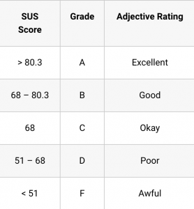
The average SUS score is 68, meaning a score of 68 places you at the 50th percentile. Here is a general guideline for interpreting SUS scores:
Your SUS task will appear to your participants as follows:
Card Sorting
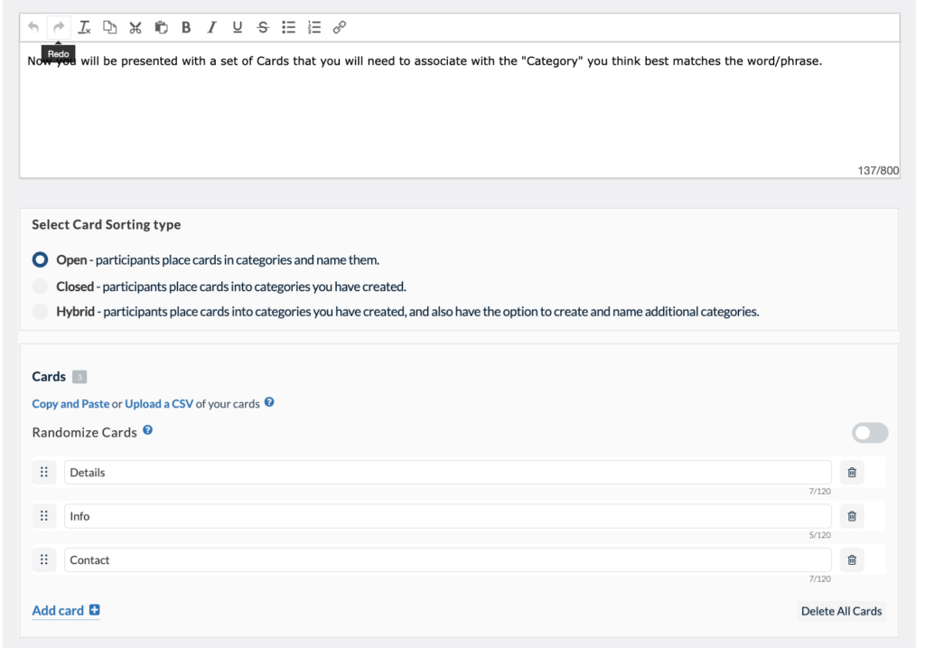
Card sorting is a popular method for understanding the user’s mental model. Instead of organizing a website by your corporate structure, you base it on how users think by having them sort items into categories.
You can create three different types of card sorting tasks:
- Open Card Sort: Participants create and name their own categories.
- Closed Card Sort: You predetermine the categories for sorting.
- Hybrid Card Sort: You predetermine some categories and allow participants to create additional categories if they wish.
Your participants’ card sorting results will be available in the “metrics” section of your Userlytics dashboard. This section includes three parts: Cards, Categories, and Recommendations.
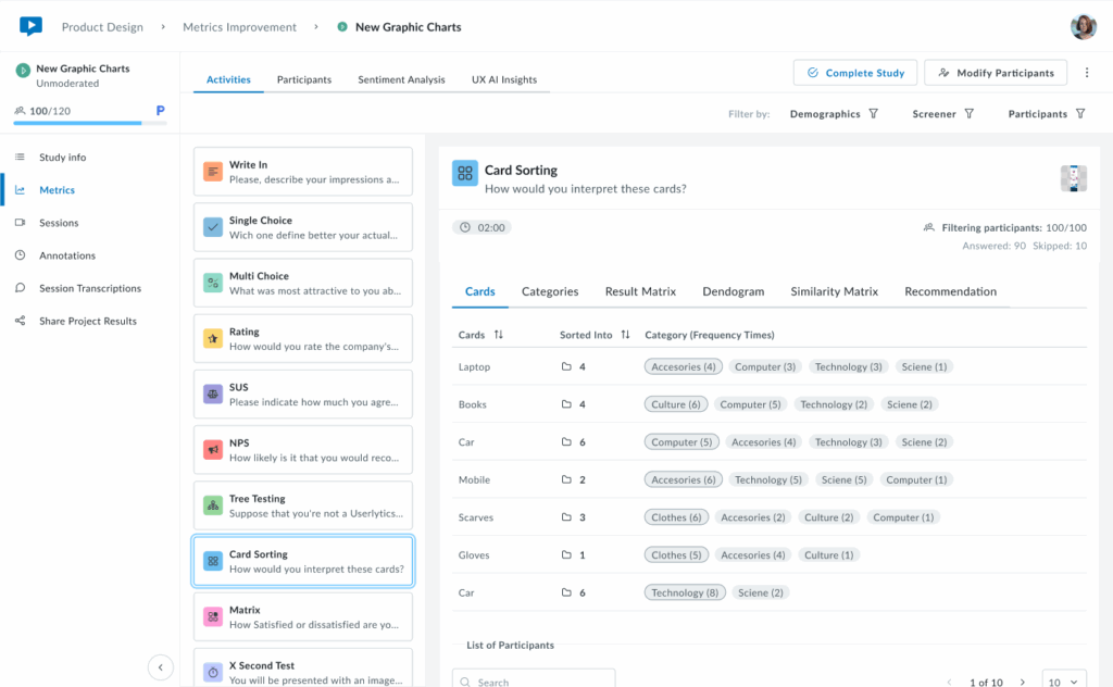
Card Metrics
The first tab of results is the Cards tab, which provides an overview of how participants categorized each card in your study. You’ll see a sortable table that displays all cards and the different categories participants used and how often.
- Cards
Cards sorted into fewer categories with high agreement indicate clear, intuitive groupings. Cards sorted into many different categories suggest confusion or ambiguity in labeling, signaling opportunities to refine your content structure.
Below the cards overview, access each participant’s complete sorting choices, time spent, and video recording to understand their reasoning and decision-making process.
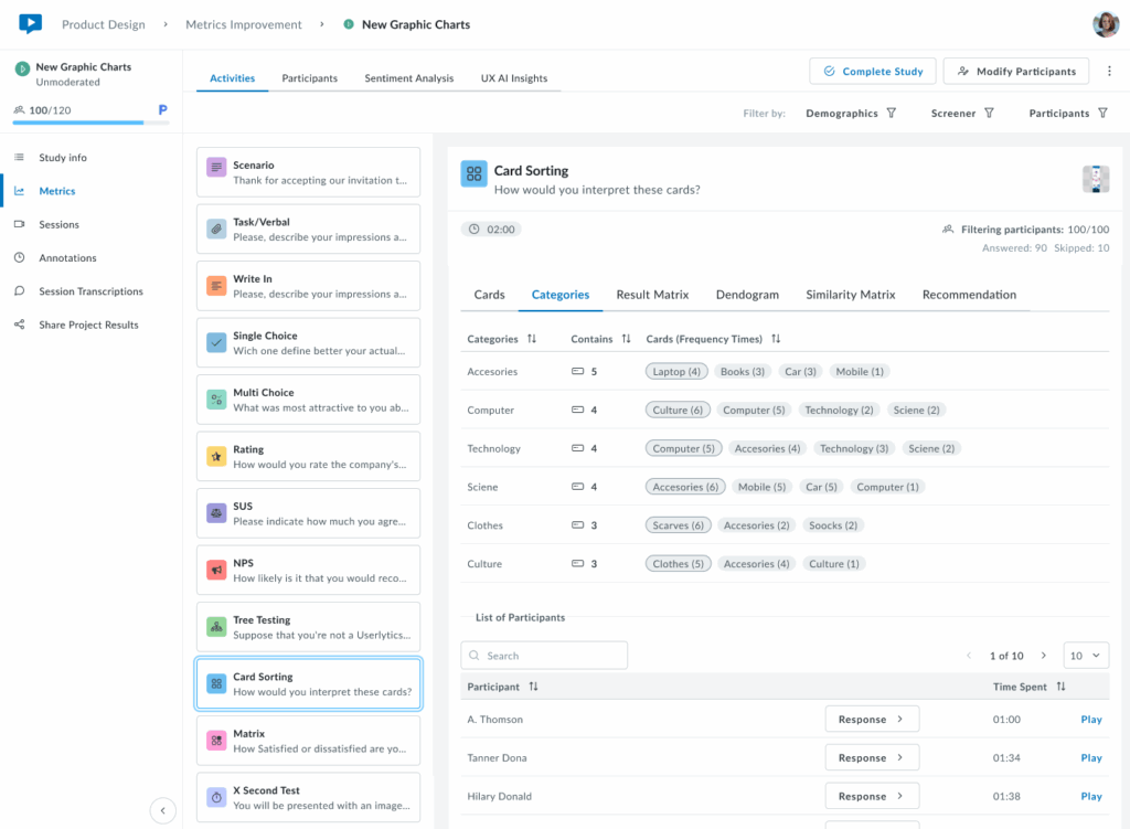
2. Categories
The Categories tab shows which cards were placed in each category. Categories can be created by participants, predefined by researchers in the Study Builder, or a combination of both.
Each category row displays the total number of cards it contains and lists all cards sorted into that category with their frequency counts (e.g., “4 (15)” means card “4” was placed in this category by 15 participants). Below, view individual participant responses and completion times to explore how each person organized the cards.
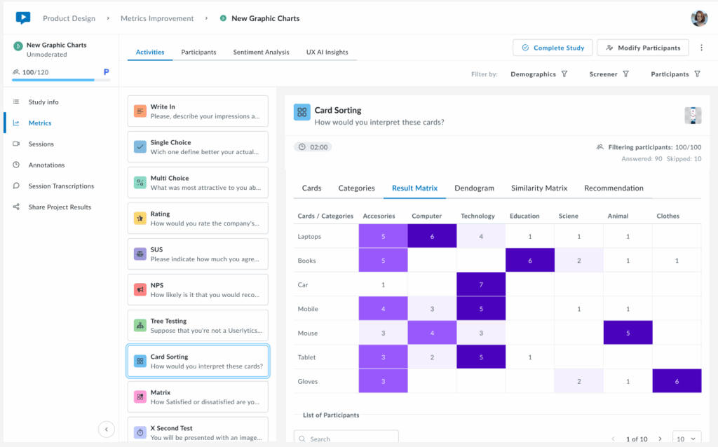
3. Result Matrix
The Result Matrix displays a color-coded heatmap showing how many participants sorted each card into each category. Rows represent cards, columns represent categories, and the intensity of the purple color indicates frequency:
- Dark purple – First option with the most responses (highest agreement)
- Medium purple – Second option with more answers (moderate agreement)
- Light purple – Third option with fewer answers (lower agreement)
The numbers inside each cell show exactly how many participants placed that specific card in that category. This visualization quickly reveals strong patterns of agreement (dark cells with high numbers) and areas of confusion (cards spread across multiple categories with low numbers).
4. Dendrogram
A brand new visualization that shows a hierarchical tree visualization that reveals how cards cluster together based on participant sorting patterns. Cards that were frequently grouped together appear closer in the tree structure, with branches showing the strength of their relationships.
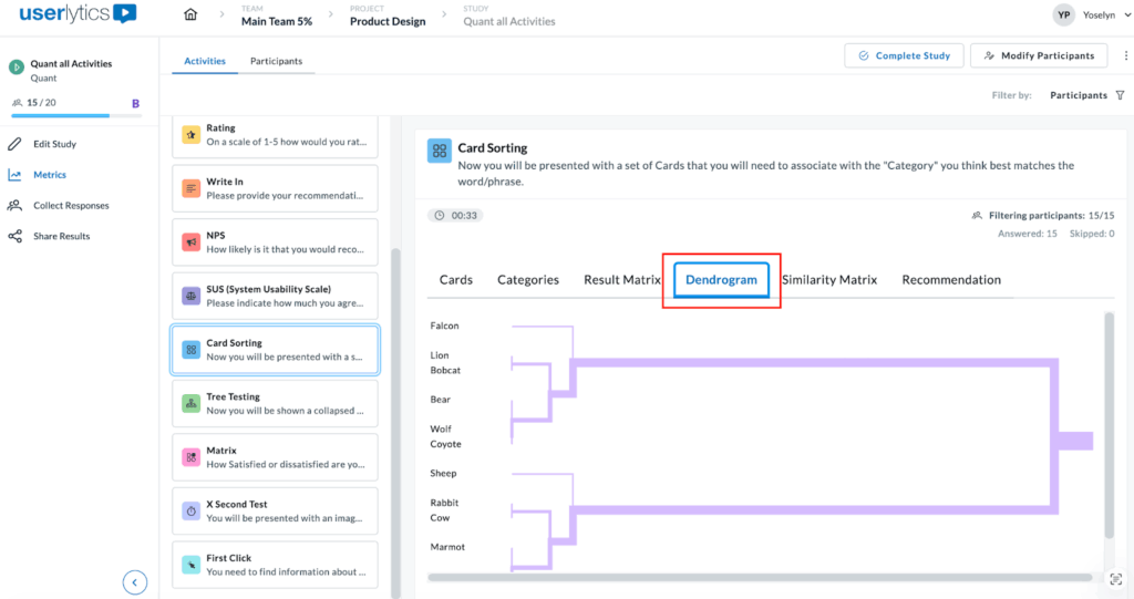
This powerful visualization helps you identify natural groupings and understand which cards participants consistently associate with one another. The horizontal distance between branches indicates how strongly related the cards are, while the shorter distances mean stronger associations. Use this view to discover logical category structures that align with user mental models.
5. Similarity Matrix
The Similarity Matrix is a color-coded grid that shows how frequently participants grouped pairs of cards together.
Each cell displays the percentage of participants who sorted both cards into the same category. Darker purple cells indicate stronger agreement, meaning most participants grouped those cards together, while lighter cells show weaker associations.
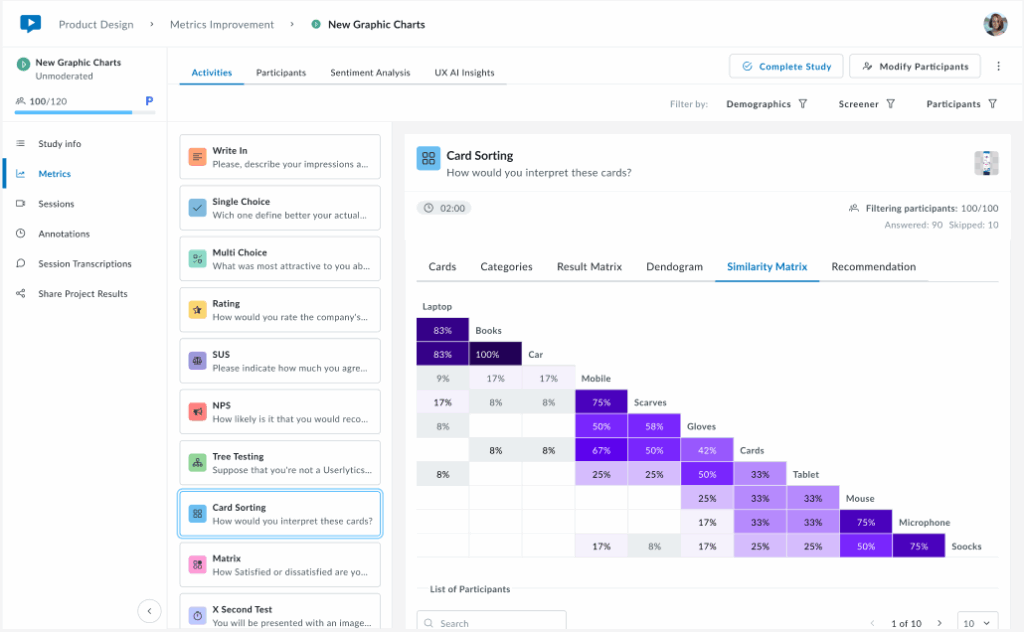
This matrix helps you identify which cards have strong natural relationships in users’ minds (high percentages) and which cards don’t clearly belong together (low percentages). Use this data to validate potential category groupings and spot cards that consistently cluster together across participants.
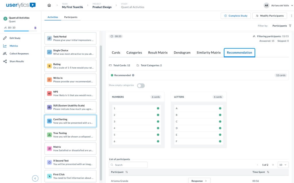
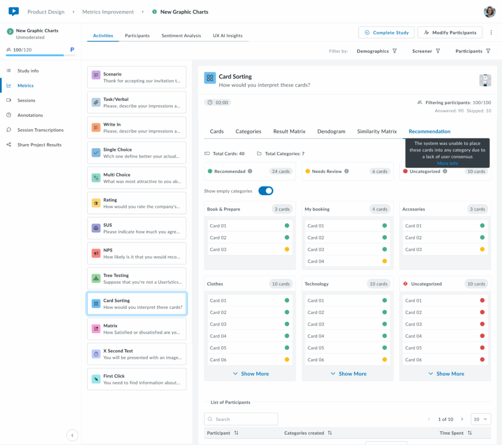
6. Recommendation
The Recommendation tab provides smart, data-driven category suggestions based on participant sorting patterns. Cards are automatically tagged as Recommended (green indicators) when there’s strong agreement among participants about their category placement.
At the top, you’ll see a summary showing the total number of cards and categories, along with a count of recommended cards. Use the “Show empty categories” toggle to view or hide categories with no card assignments. This intelligent analysis helps you quickly identify which category structures have strong user consensus, making it easier to finalize your information architecture with confidence.
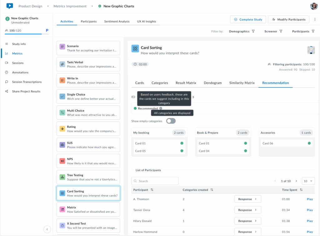
When you hover over icons or indicators in the Recommendation tab, small black tooltips appear to explain their meaning.
For example, hovering over the Recommended tag displays the message “Based on users’ feedback, these are the cards we suggest including in this category.”
This indicates that there is strong participant agreement on where each card belongs. Another tooltip appears near the category toggle, stating “All categories are displayed,” confirming that all available categories are currently visible.
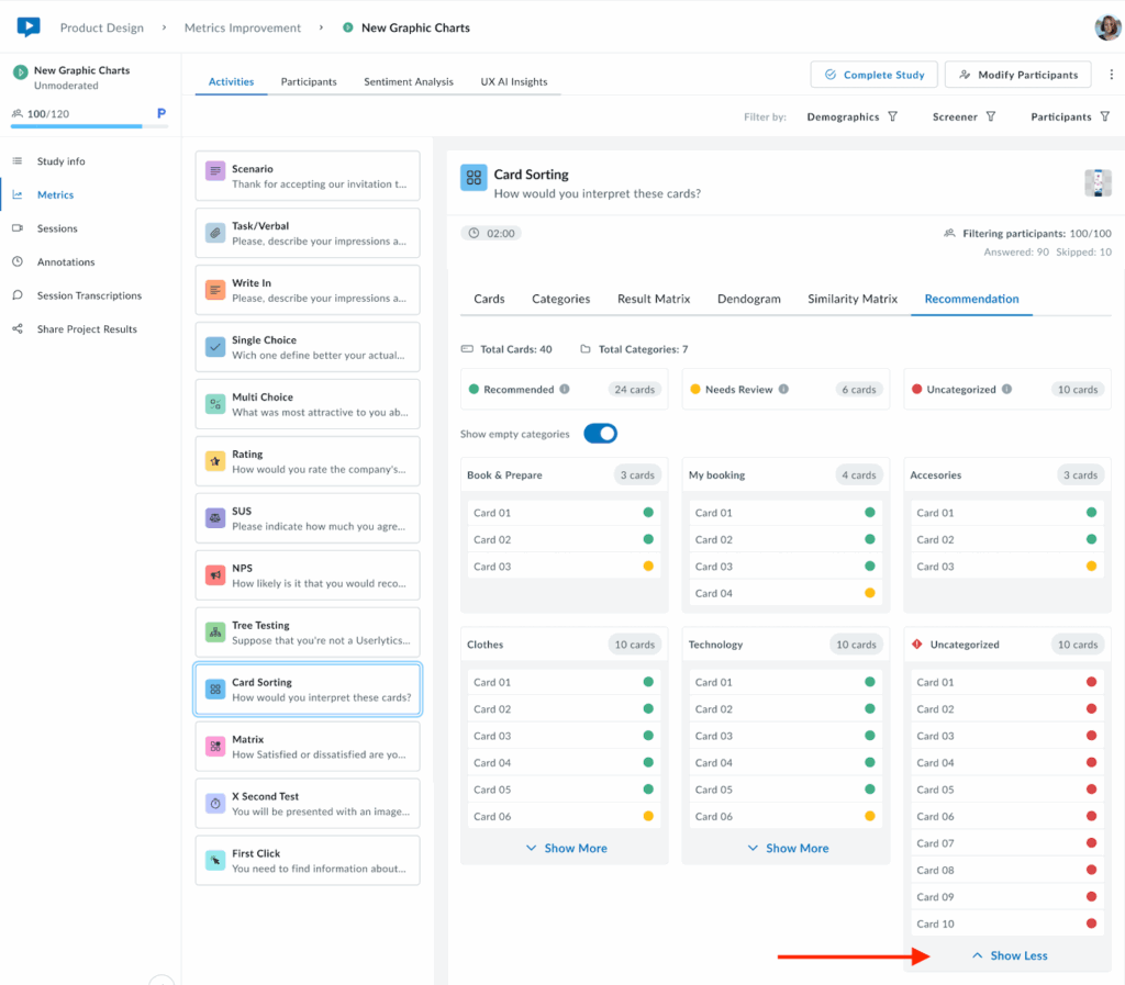
The following view shows the Recommendation tab in a more typical scenario where cards have mixed classification statuses. The system automatically tags each card based on participant sorting behavior. Cards marked with a yellow indicator are tagged as Needs Review, suggesting that user responses were inconsistent or unclear. When hovering over the yellow tag, a tooltip appears that reads: “User responses suggest that these cards are unclear. It may be worth considering a different category or renaming the card.” This helps users understand why certain cards may require attention or adjustments.
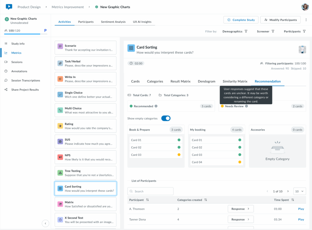
At the top, a summary shows the total number of cards and categories, along with a count of cards under each status. The Show empty categories toggle is on, so even empty categories (like “Accessories”) are displayed. This provides a complete overview of all possible categories, helping users see both assigned and unassigned cards in one place.
The following view shows the Recommendation tab with all three card statuses: Recommended (green), Needs Review (yellow), and Uncategorized (red). These tags indicate how consistently participants sorted each card.
Hovering over each label displays a tooltip explaining its meaning. For example, the Uncategorized tooltip says the system couldn’t place those cards into any category due to low participant agreement.
At the top, you’ll see the total number of cards and categories, along with counts for each status. Through the Show empty categories toggle you can see all categories being displayed, including the empty ones.
Only 6 cards are shown per category. If you want to see all cards per category, click on the “Show More” button and all cards corresponding to a category will appear.
Lastly, this view shows the Recommendation tab when all cards are classified as Uncategorized (red). This means the system was unable to assign any cards to a category due to low participant agreement. The tooltip explains: “The system was unable to place these cards into any category due to a lack of user consensus.”
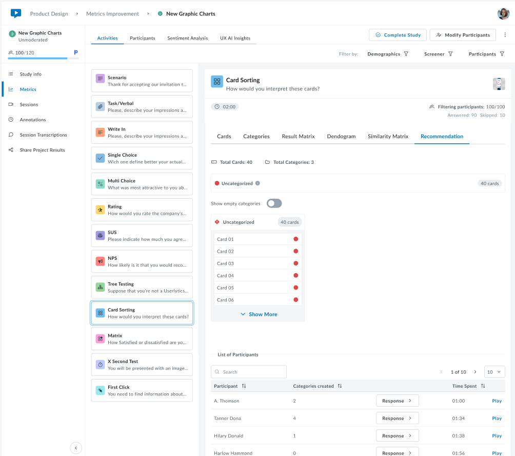
This scenario typically indicates that participants sorted the cards in very different ways, with little overlap between their choices. It signals that the categories or card labels may need to be reviewed or refined before finalizing the information architecture.
Tree Testing
A “Tree test” is another term for a reverse card sort. It evaluates a hierarchical category structure, or tree, by having users find the locations where specific tasks can be completed. Including a tree testing task in your usability test can help verify the validity of the information structure and the findability of different products or themes on a site, mobile app, or prototype.
To build your Tree Testing task:
- Customize the text your testers will see. Define the product or theme your participants will sort into a specific category.
- Define your categories or menu hierarchy. You can also define subcategories to get more specific.
- Participants will sort through these categories and choose where they believe the specified product fits best.
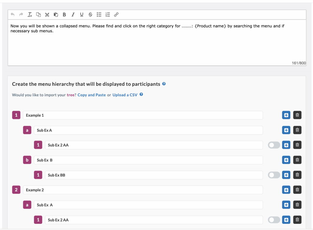
After naming your categories, click the toggle bar on the right-hand side to select the correct response to the task. This will allow you to view the success rate of your Tree Testing task once your participants complete the usability test.
Your participants’ tree testing results will be available in the “metrics” section of your Userlytics dashboard. This section includes three parts: Option Selected, First Click, and Other Info.
Option Selected
Clicking “Option Selected” on the left-hand side will display the percentage of participants who chose each answer option for your Tree Testing question.
First Click
The middle section, “First Click,” provides information about whether any participants initially clicked on one category but then switched to another before making a final decision.
The pie chart shows the percentage of participants who exited a path after entering that tree. This information is helpful because it indicates if participants hesitated before selecting a final category, suggesting that your categories may need fine-tuning to be more clear and intuitive.
Other Info
The third section on the right-hand side, “Other Info,” provides data about the overall results of your Tree Testing task. This includes the percentage of participants who found the correct path without any backtracking, the number of participants who selected the correct option on the tree, and the average time participants spent on the task.
Depending on the results, you may see a red highlighted “WARNING” button. Clicking this button will alert you if the success rate of your task is lower than the industry average. If so, you may need to consider revising your categories for added clarity.
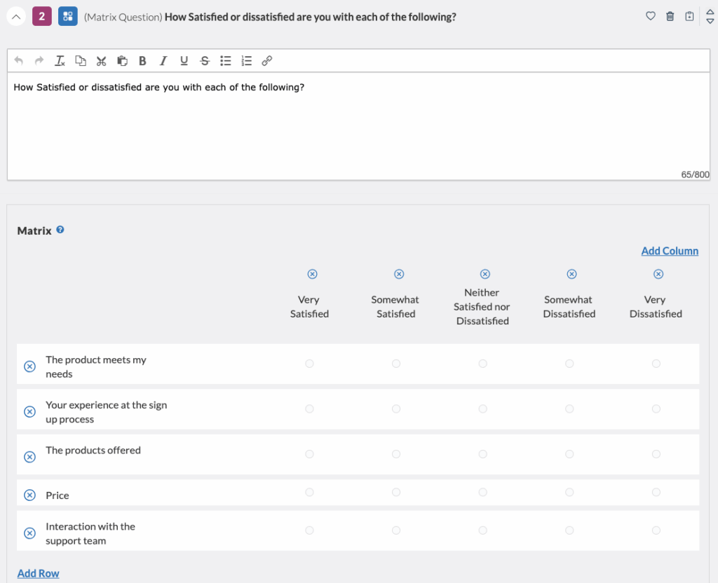
Matrix Questions
A matrix question groups together relevant questions on a particular topic in a row-column format. This simplified format allows participants to view and answer survey questions at a glance. Matrix-style answer choices are often offered on a scale.
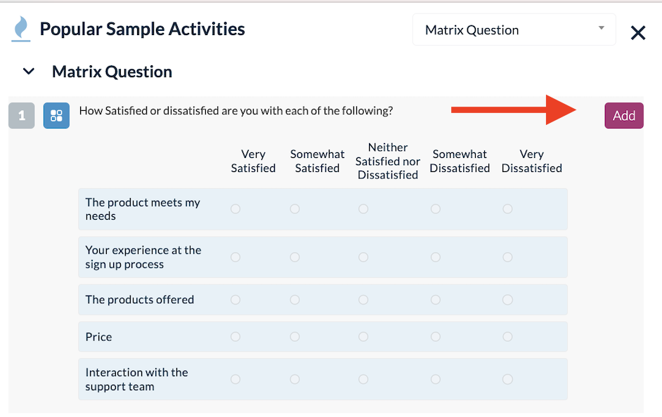
Here’s why you should consider using Matrix questions for your study:
- It saves space: Matrix questions display multiple questions and answers on one page, reducing lengthy surveys.
- Reduced response time: Consistent response options make it easier and quicker for participants to answer.
- Increased responses: Clear layout and simple answer options encourage more participants to complete the survey.
- Eliminates monotony: Groups related questions together, reducing the repetitive nature of surveys.
- Insight on sub-topics: Matrix questions provide detailed views on specific aspects of your product or service.
You can analyze the results of your matrix question within the “Metrics” of your completed study.
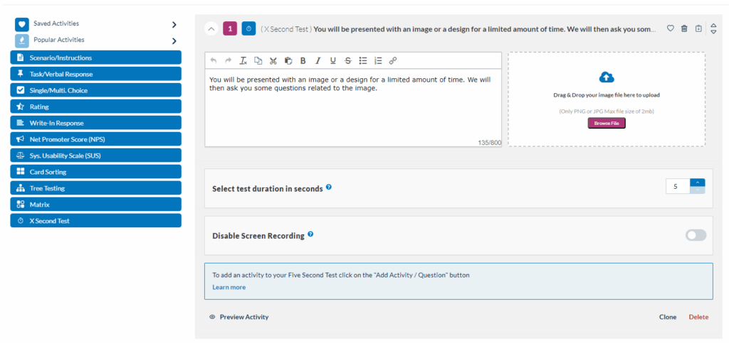
X-Second Test
The X-second test quickly captures people’s immediate reactions. You show them something for a brief period, usually 5 seconds, and then ask for their thoughts or feelings right away. By uploading images and screenshots to the Userlytics platform, this method helps understand what people first notice and their initial, often unconscious, responses.
Once you select this activity, a new window will appear prompting you to confirm your choice. Click “Add”.
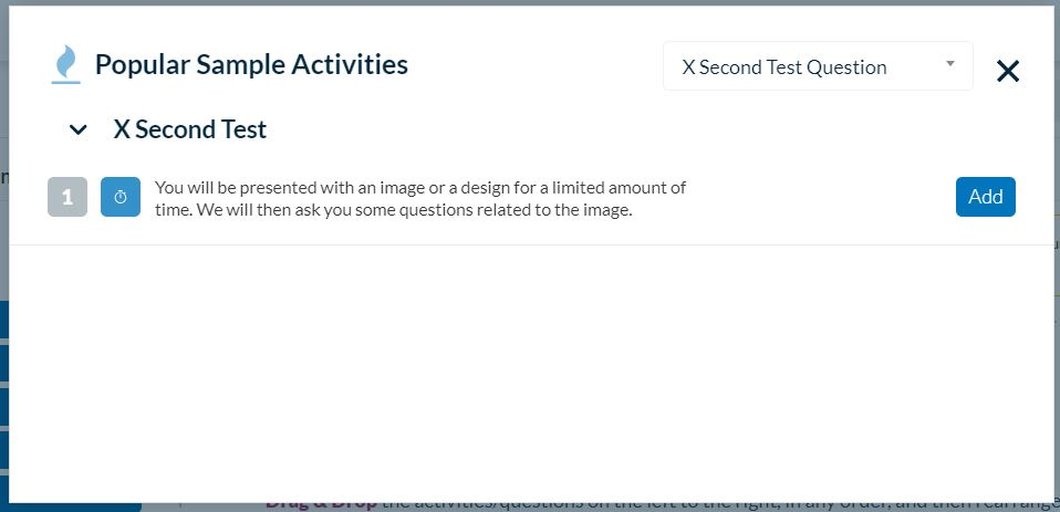
Once this is done, click on the activity you just created and fill out the details. These include the question that will appear on the participant’s screen, the file you want them to see, and the duration in seconds.
First Click Testing
This activity type helps you understand user behavior by tracking where they click first on an image.
By analyzing these initial clicks, you can see if your design is intuitive and easy to navigate.
First Click Testing works smoothly on both mobile and desktop platforms, and is available in all Userlytics subscription plans.
It supports every testing approach, from unmoderated to moderated, making First Click Testing a versatile tool for all your UX research needs.
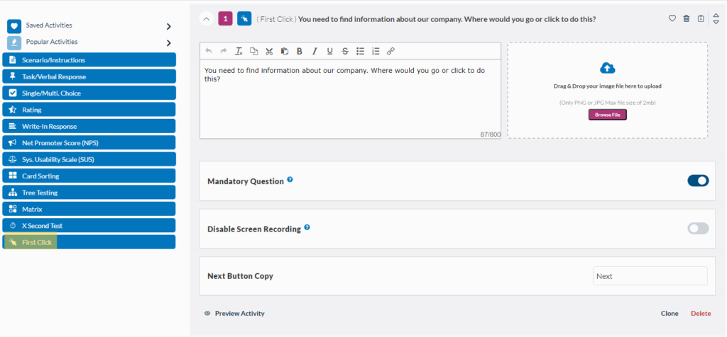
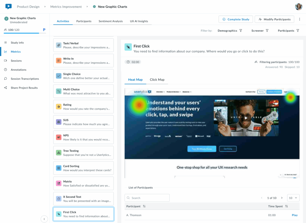
It works by uploading an image or screenshot of your website, app, or prototype. You’ll receive a comprehensive heatmap and click map showing where users clicked on specific areas.
After setting up your First Click activity test, you can view the results on your study Metrics dashboard, where you’ll be able to toggle between two visualization modes:
- Heat Map: The results are displayed as a heatmap showing the areas where participants clicked most frequently. Heat zones are color-coded to represent click density, with warmer colors (red, orange) indicating higher concentrations of clicks and cooler colors (green, blue) showing lower activity.
2. Click Map: Displays precise individual click positions overlaid on the design.
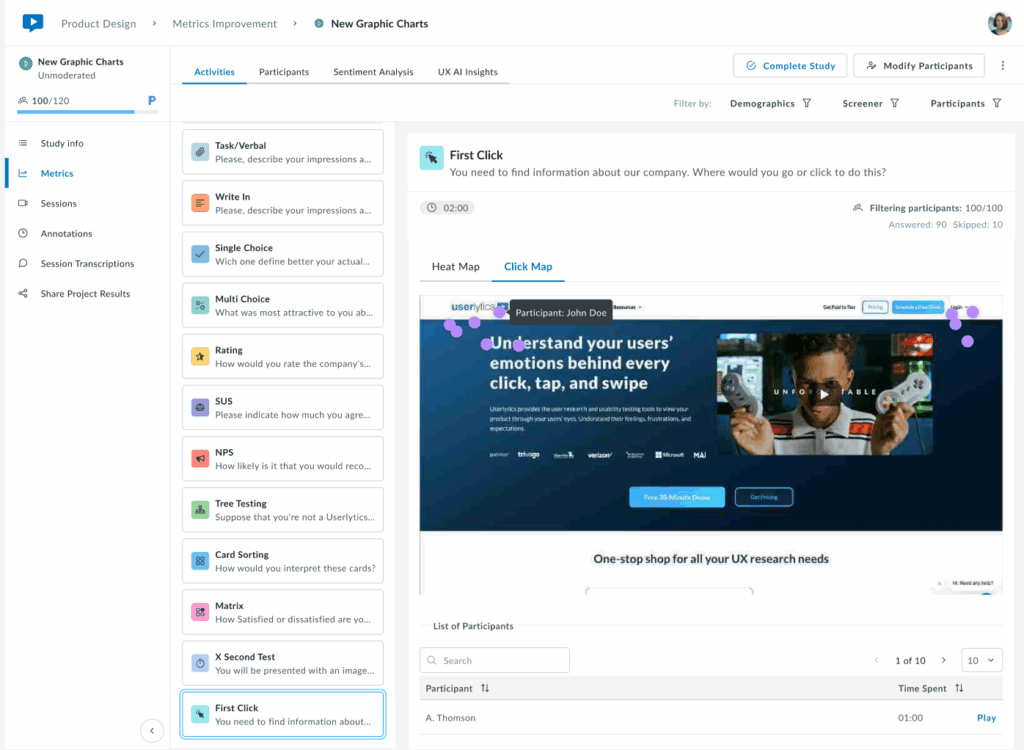
Below the visualization, a sortable table lists each participant with their time to first click.
Key Insights:
If first clicks concentrate on the correct element (e.g., a primary CTA or navigation item), your visual hierarchy is working. Scattered clicks or concentration in unexpected areas signal potential issues with visual prominence, labeling, or layout that may require adjustment.
Ideal for validating that users navigate intuitively from the start and that the most important elements stand out effectively.
Hovering over the heat-zones with your mouse will provide a detailed breakdown of the number of participants who clicked in that specific location.
Remember to Preview Tasks!
After building out your test tasks, be sure to preview each one to ensure they are easy to understand, well-written, and work well with your test asset.
You can choose to run a “Quick Preview,” which allows you to check the flow of tasks and questions through an interactive HTML interface without downloading the Userlytics Recorder or displaying your test asset.
Alternatively, you can run a “Recorder Preview,” which uses the Userlytics Recorder to simulate a real test without any actual recording or uploading.